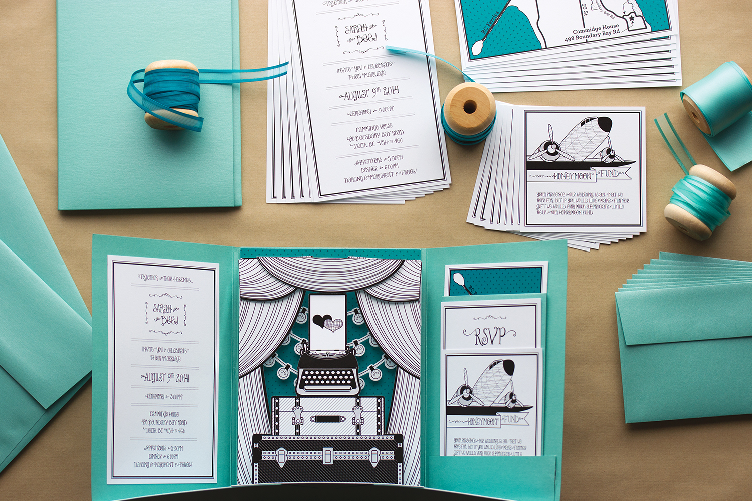
ANTIQUE INSPIRED POP-UP WEDDING INVITATION
Trunks, suitcases and typewriters, oh my! This antique inspired wedding had it all! And we decided to incorporate the wedding décor right into the invitation itself. With gorgeous globe lights, vintage suitcases and authentically antique typewriters, how could you go wrong? Different tints and shades of teal were the wedding colours of choice and we just love how this whole suite turned out. Vintage for life!
PROJECT – Wedding Stationery Suite for Sarah & BJ
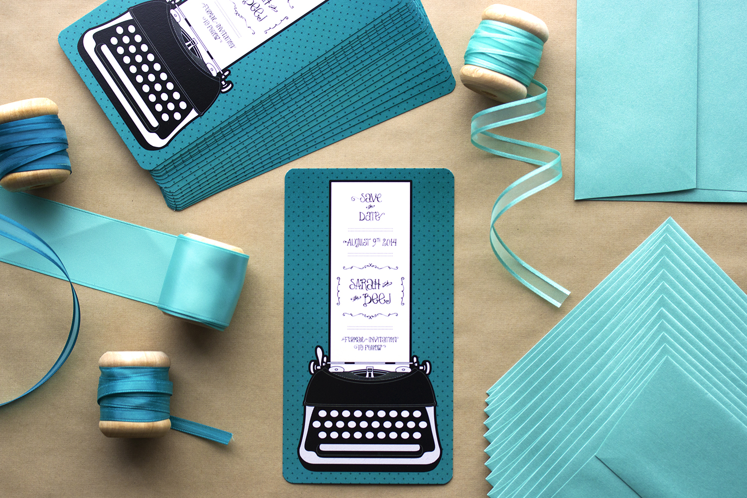
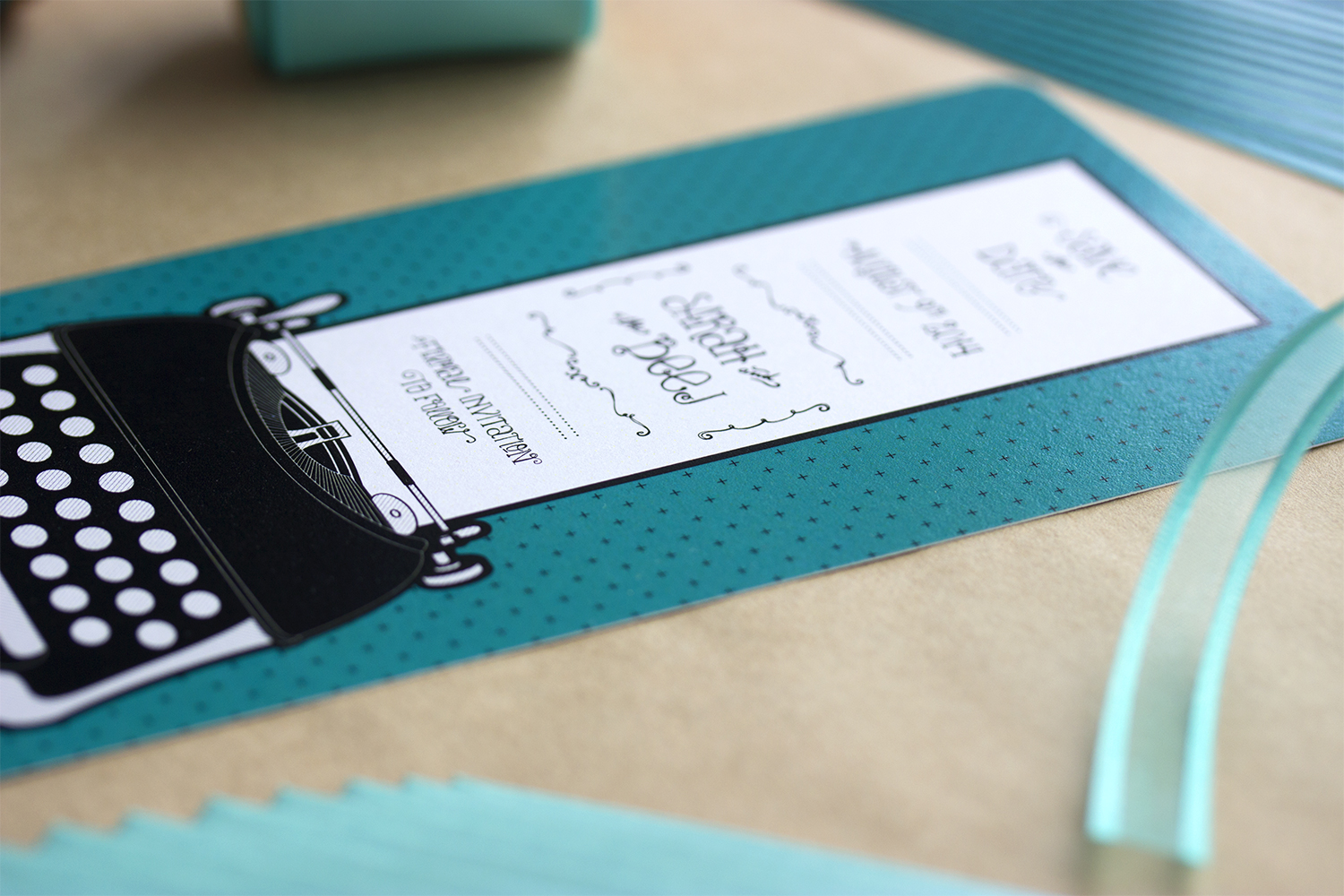
SAVE THE DATE
It was important for the bride to have the Save the Date piece 'go' with the rest of the wedding stationery. At this point, we didn't have a solid game plan for what the wedding invitation would look like, but we knew we wanted to incorporate the bride's love of antiques. Her antique typewriter would be used as a welcome sign for her guests and we thought 'Perfect! Let's use the image of the typewriter as the basis for our Save the Date!'. We illustrated the very same typewriter (a Remington 5 model) that would be making an appearance at the wedding! We really love little consistencies like this and we were so excited to see if anyone would make the connection!
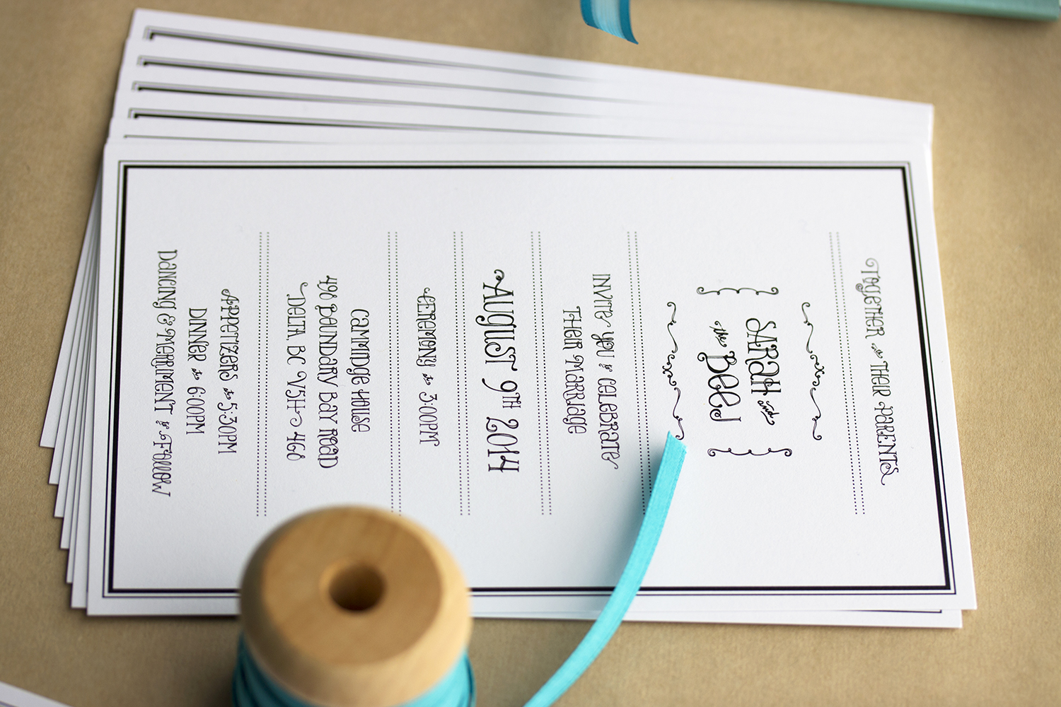
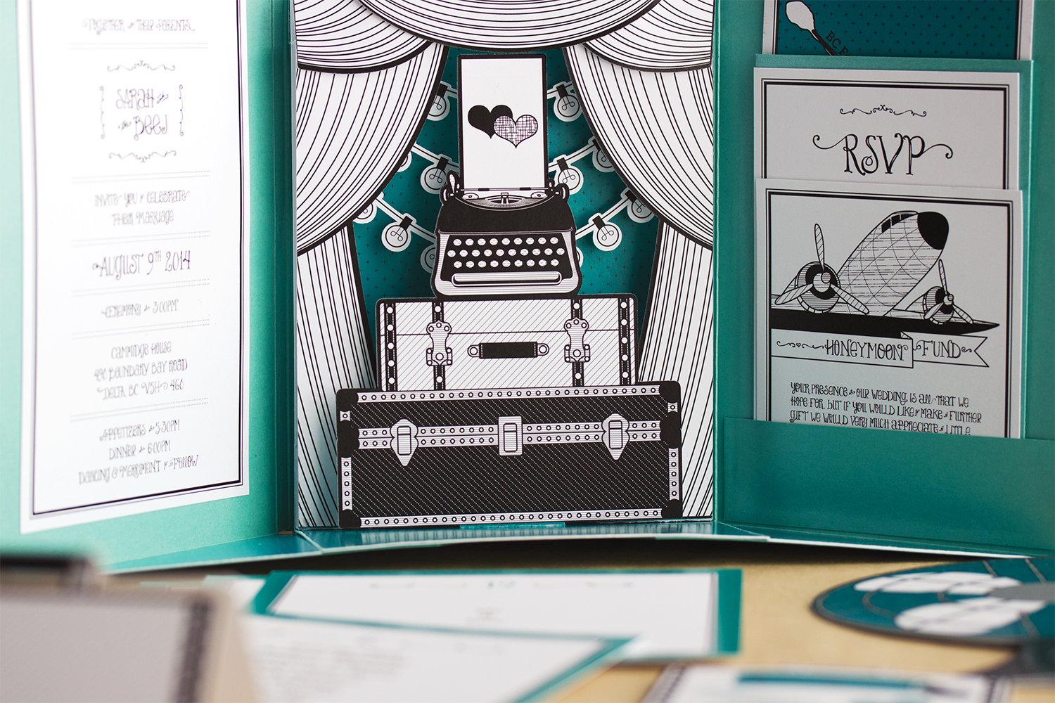
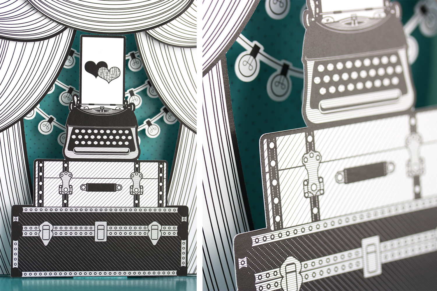
WEDDING INVITATION
Once the majority of planning and décor had been taken care of, it became pretty clear that we wanted to represent the look and feel of the wedding itself as our wedding invitation theme. Since the bride was our very own Sarah from Stationery Bike Designs, we knew we had to go big or go home! The analogy we kept coming back to was that of a hair dresser: If you are entrusting someone to do your hair, they better have amazing hair themselves, otherwise why even bother? The same goes for a stationer: Their wedding invitation had better be something absolutely show stopping! This is where the pop-up element came in and we knew we had a home run on our hands.
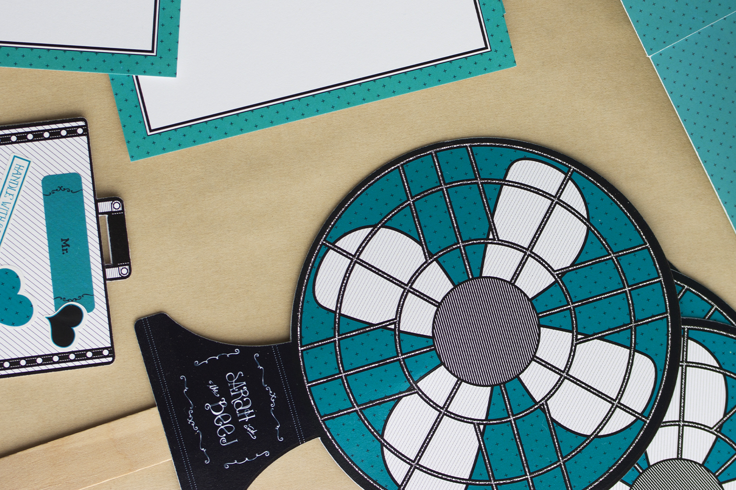
PROGRAM FAN
The wedding was in August, and it was one of the hottest Augusts on record! We wanted to make sure that we honoured the couple's parents in the program, and we also wanted it to pull double duty as an actual fan with which people could cool themselves because, hot! We also carried the antique theme through and illustrated a fan to go on the front of the Program Fan. So meta! People loved the added detail of the fan being an actual fan. And they were very thankful for them because these cooling fans were desperately needed!
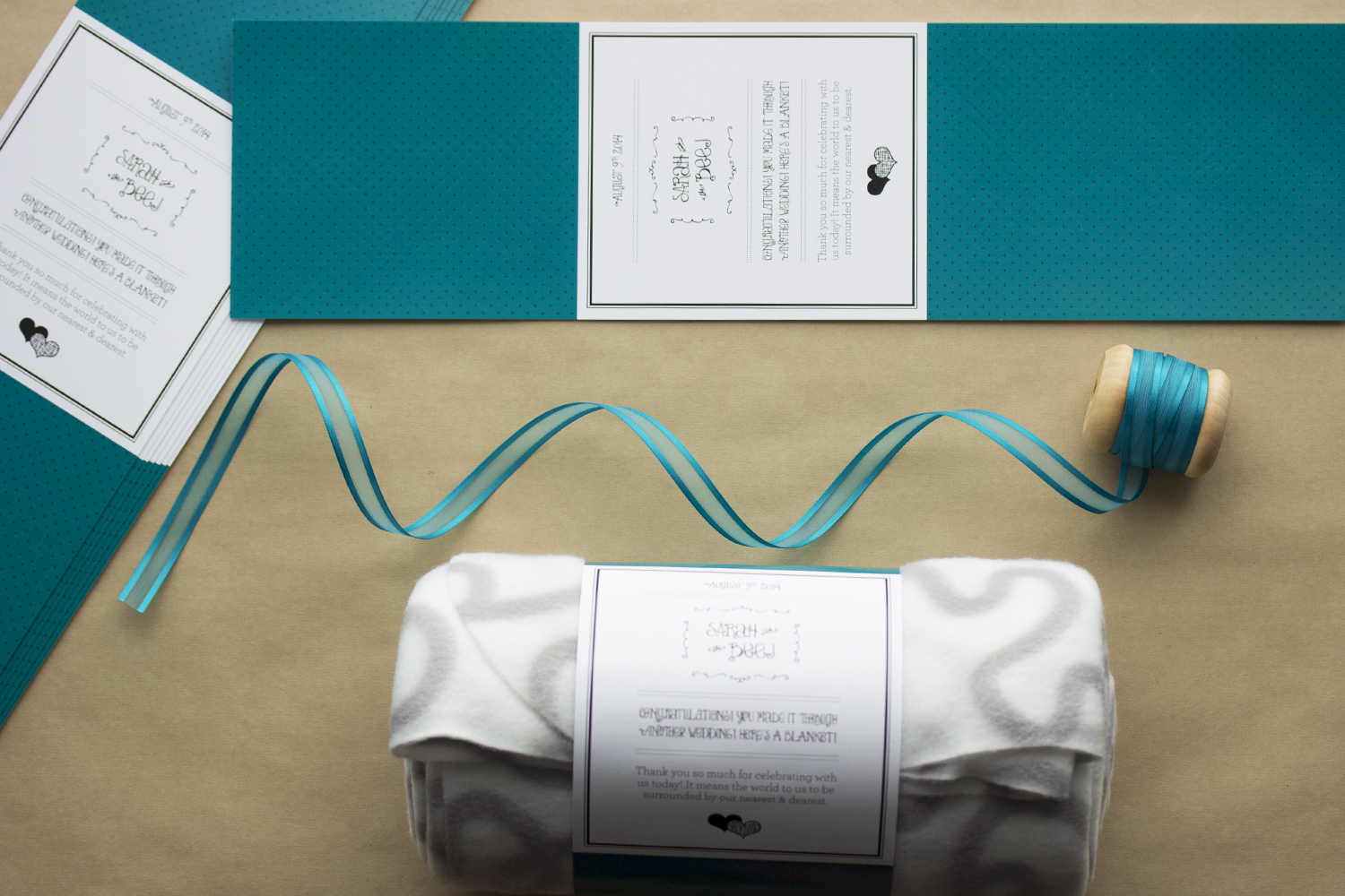
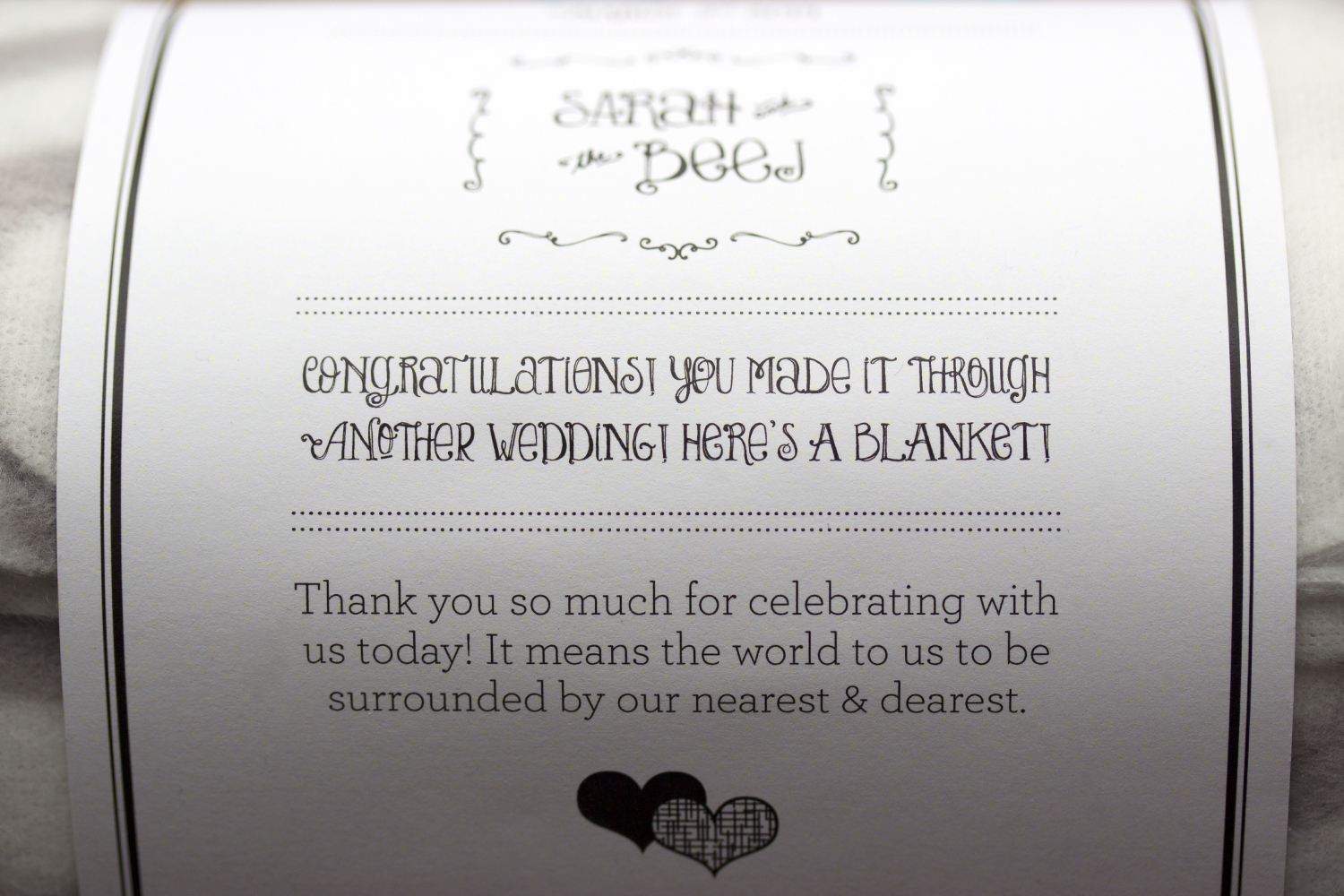
BLANKET FAVOUR
Though the day was extremely hot, the night air wasn't so soothing to some. Thankfully, the couple had blankets as their favours! It played off the Program Fans very well: Fans for the outdoor ceremony to keep cool, blankets for the outdoor reception to help warm back up! These blankets were from IKEA and came perfectly wrapped with their own label. We created a custom blanket/favour label and adhered it to the original. It was a huge hit! It's so nice to visit someone's house and see that the favour you lovingly put together is being used to this day. Just like the blanket, it makes us feel all warm and fuzzy!
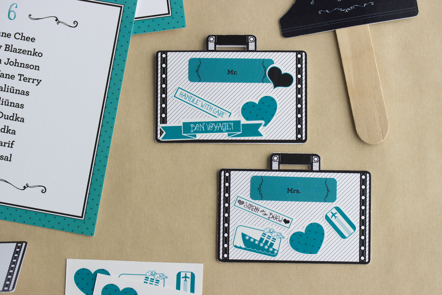
PLACE CARDS
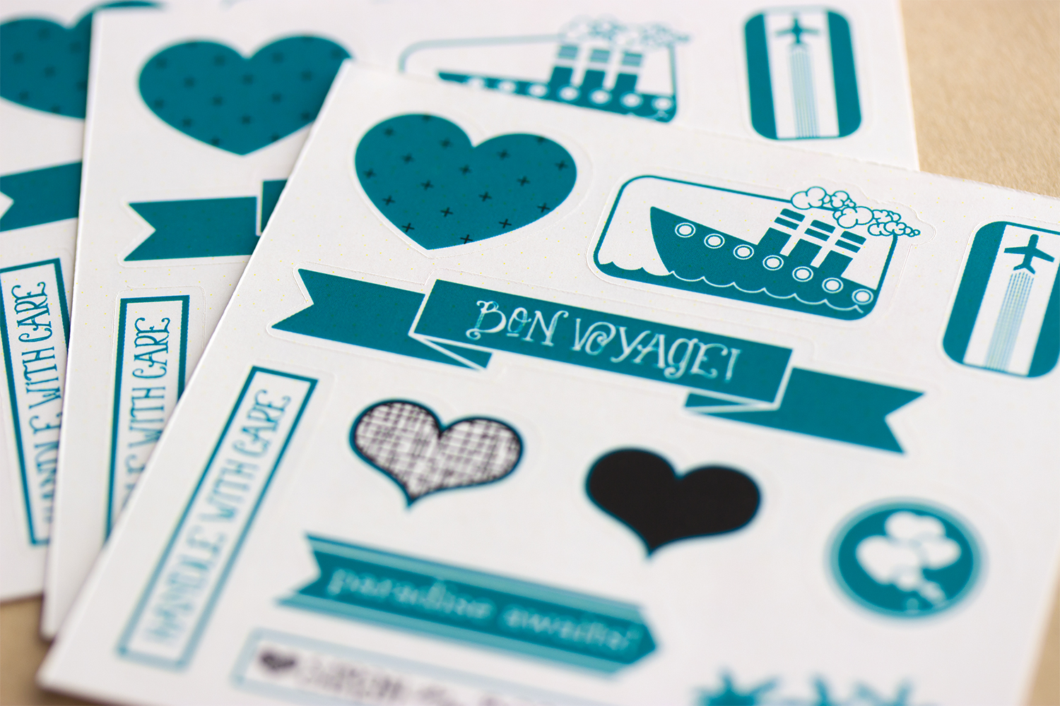
Along with an antique typewriter, this wedding also had amazing vintage steamer trunks and suitcases! We decided to incorporate the suitcases into the wedding stationery and feature them as little place cards. They acted as tiny tent cards, standing upright and came with each guest's name stuck to the suitcase using a sticker. We really like the idea of interactivity when it comes to our designs, and so we decided why not have some travel themed stickers for the guests to decorate their place cards? They were a fun little addition and gave guests something to do while they were waiting for the reception to begin.
The top left corner shows a hint of the Seating Chart we created. It was very simple, clean and played off the colours, patterns and typography used throughout the suite.
PLACE CARD STICKERS
We custom designed and illustrated these teeny travel stickers to go with our suitcase place cards. It was especially fitting since the bride & groom opted for a honeymoon fund rather than a gift registry. We used the recurring themes of colour, repeated pattern, similar illustration styles throughout and, of course, the two hearts from the invitation, representing the bride & groom, respectively. These were a blast to create and we sincerely hope that each guests enjoyed playing with these stickers and arranging them on their place card.
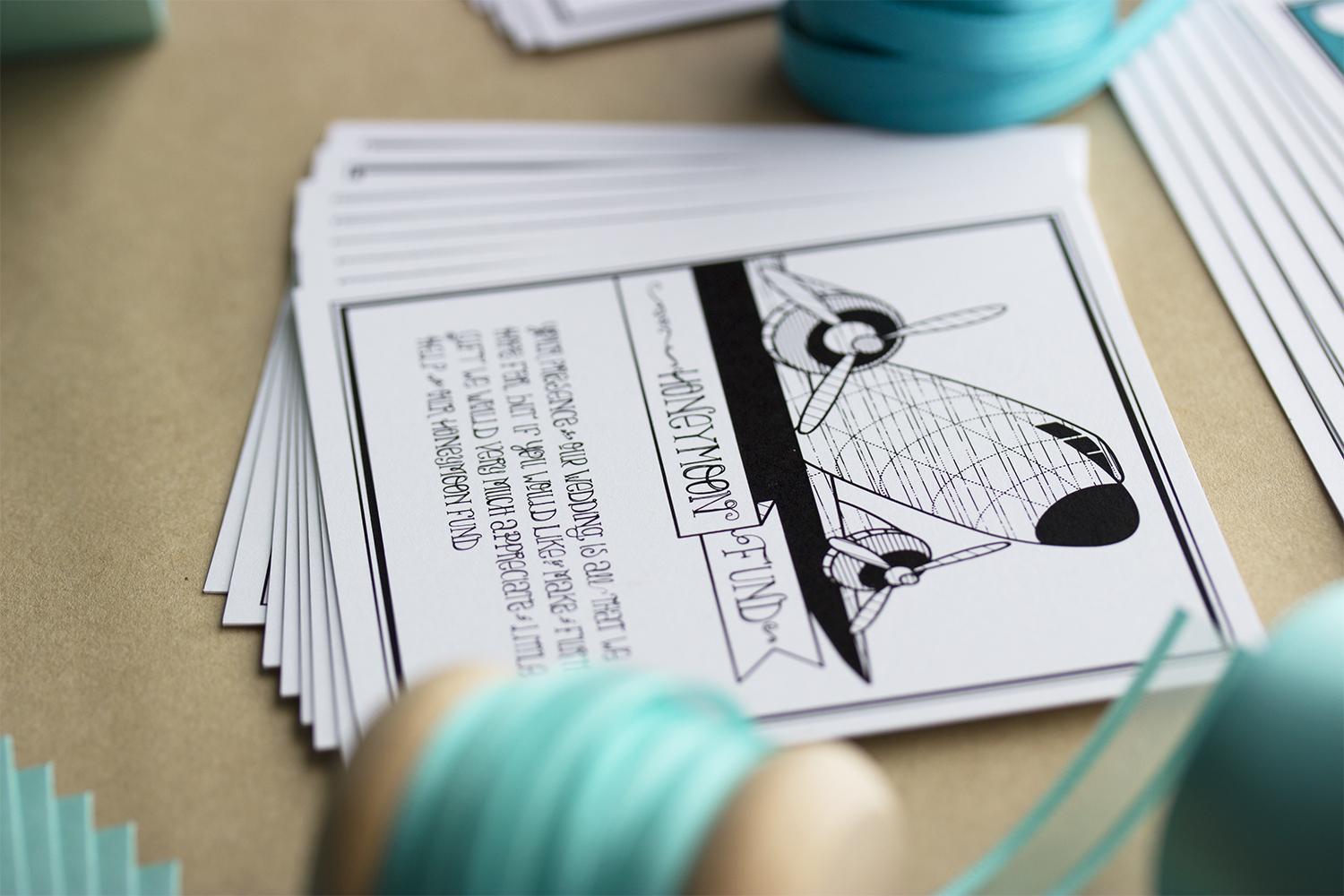
HONEYMOON FUND
Money as a gift can be a tricky subject when it comes to weddings. It's becoming more and more common these days for couples to request money rather than gifts for the house & home. This is most likely due to the fact that modern couples are moving in with each other well before their wedding day. It defies traditional conventions, but is gradually becoming accepted with each new generation. The bride & groom wanted to make it clear that they did not expect any gifts. However, should a guest like to give something to the happy couple, they wanted to express how lovely it would be if the guest could make a contribution to their honeymoon fund: Your presence at our wedding is all that we hope for but if you would like to make a further gift we would very much appreciate a little help with our honeymoon fund. Short, sweet and simple.
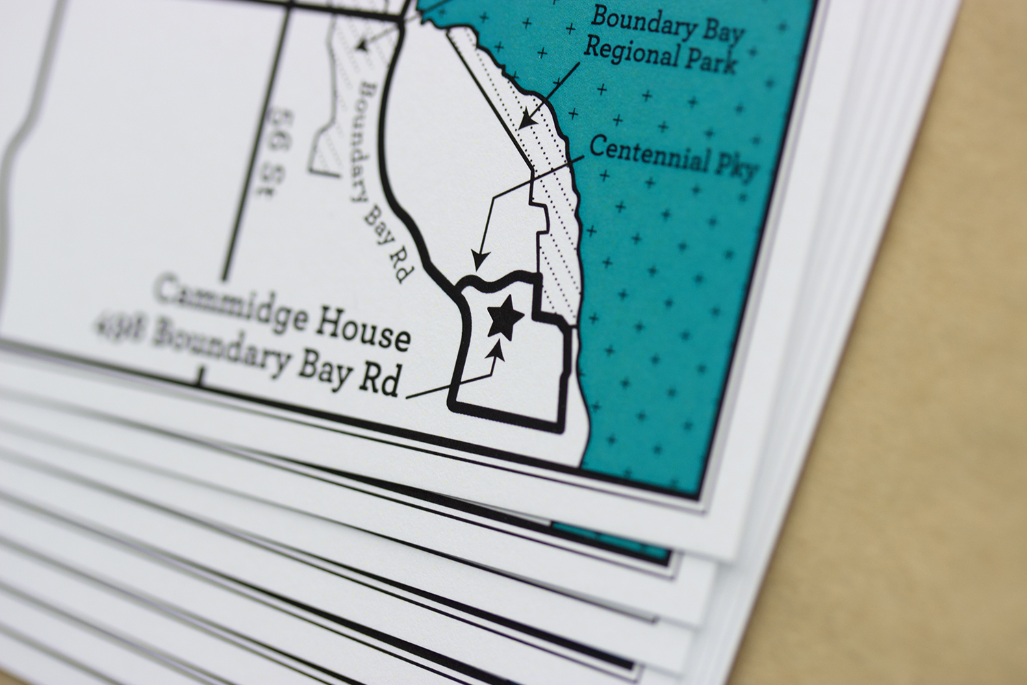
MAP CARD
Our lovely bride & groom had both their ceremony and reception in the same place (Cammidge House, in Boundary Bay Regional Park). The couple didn't live in that area, and neither did the guests, so we decided that a simple map would be very useful. We used patterns, colour and typography to tie it in with the rest of the stationery suite.