WELCOME TO OUR NEW HOME ON THE INTERWEBS!
Thank you so much for stopping by and taking a peek. We're still tinkering and adding bits and bobs here and there, so please bear with us as we prepare something truly spectacular! We will be adding more content in the coming months, but in the meantime please feel free to peruse at your leisure. Happy exploring!
BACKGROUND
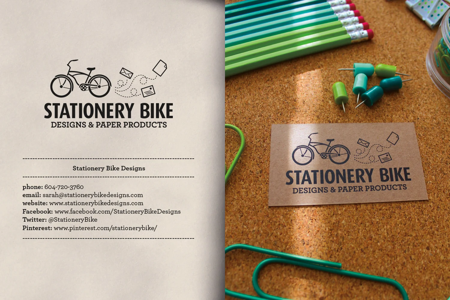
Stationery Bike Designs is the brainchild of Sarah Dakiniewicz. She is the owner/graphic designer/illustrator. She graduated from Kwantlen Polytechnic University with a Bachelor of Applied Design from the Graphic Design for Marketing Program. Prior to that she received a Certificate in Applied Design from the same institution, this time from the Interdisciplinary Design Studies Program.
During her schooling, and shortly after graduation, she had interned for both paid and unpaid positions at the following design/advertising firms:
- RETHINK COMMUNICATIONS (2 unpaid internships during school) Rethink is an award winning advertising and design firm. They consistently produce high quality, out of the box style communications for their vast list of well known, high profile clients including, but not limited to: A&W Restaurants, Playland, Molson Canadian (the famous ads where they place various beer vending machines in foreign countries and require a Canadian passport in order to receive a beer), Shaw, Science World, and Coast Capital Savings, to name a few.
- STEP UP COMMUNICATIONS (1 paid internship lasting the course of the summer) This firm specialized more in corporate communications for clients such as: The Elizabeth Fry Society, various book covers and designs for authors and printed communications for banks.
It was a nice mix of ultra corporate and ultra creative. In our humble opinion, it’s important to have an understanding of both in order to be a well rounded designer.
From there Sarah was seeking employment post school and fell into a position at a print shop where her husband (then boyfriend) worked. It wasn’t glamorous but it has helped shape her into the designer she is today. Sarah started out in bindery. It’s the lowest position on the print shop totem pole. But she loved it! People warned her of the monotony, the repetitive tasks and the mountainous piles of never ending work. She faced those challenges head on and became very efficient. It also gave her a strong belief in quality control for customers. She wanted to make sure that everything coming out of the shop was of the utmost quality because that is what she would expect as a paying customer. Sarah always had her design clients in mind as she worked her way up that totem pole.
Her next position (in the same company) was a promotion to Production Coordinator. In this position she was responsible for scheduling jobs on the 5 presses, ordering paper for jobs, meeting with the 5 pressmen twice daily to ensure quality and check in on their progress. If there were any issues Sarah would report to her manager and reschedule jobs as needed. It sounds dull, but Sarah LOVES all things print!
She was then promoted to the Art Department where Sarah was responsible for creating and prepping files for offset printing, plating jobs for the presses and doing pre-press/pre-flighting on all files, ensuring that they were fit for production.
Why are we mentioning all of this? We have a very strong background in printing. We understand it both from a design point of view, a customer point of view and, most importantly, from a print production point of view. This allows us to not only produce fantastic designs for our customers, but also how to create those files for print, what sorts of issues might arise in print production and how to effectively and efficiently design for the benefit of our clients. We also have a rich pool of printing contacts from which to pull whenever a print need arises.
Let’s move on to the good stuff, shall we?
SOCIAL MEDIA MANAGEMENT
NICHE STYLISTS
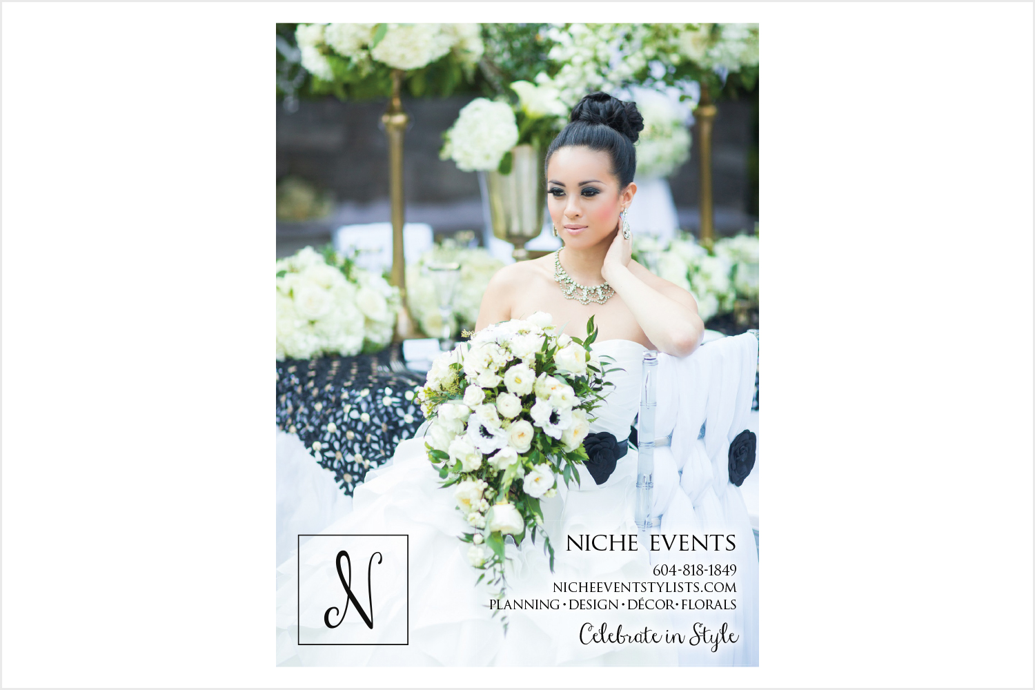
We have been creating social media content/captions and then posting on behalf of Niche Stylists. We've also had the pleasure of attending the weddings Niche has produced and taken photos of their work for their portfolio, blog posts we create on their behalf and social media. It's always such a treat to get a sneak peek at each couple's event. The dresses, the décor, but most importantly the love! Each and every couple we have the honour of seeing on their wedding day is always just brimming with blissful joy. There really isn't anything like it. It's just beautiful.
LOGO/BRANDING DEVELOPMENT
THE FLYING FOX ART AND DESIGN
Specializing in jewellery design consisting of mostly rings and engagement rings, The Flying Fox was looking for a rebrand. Their logo at the time was not syncing up with who they were as a business and we were tasked with creating a memorable, strong visual identity that tied into the fox motif and jewellery. We decided on a winged, faceted fox. It was the perfect fit for this edgy, strong woman and her beautiful business.
We also created a horizontal version of the logo, suited for applications that the fox simply did not fit into as easily as we would have liked. It’s very common for a company to have a variety of logo versions for different applications: vertical logo, horizontal logo, monogrammed emblem, etc. We are working on developing a monogrammed version, currently.
SAPPHIRE STITCHES
A small company making adorable amigarumi creations, one loving crochet stitch at a time. We decided on a very handmade feel for this company’s identity, playing up on the idea of a ball of yarn and the love that goes into every stitch. We hand illustrated the yarn ball and then converted it into vector for digital and print applications.
DOLCE VITA
This identity was developed for a young entrepreneur starting her business in Public Relations. She is a very sophisticated lady, with a love for the good things in life. She wanted to attract like minded individuals to her business and so we focused on developing a logo that exudes those qualities. We wanted the brand to represent high quality, sophistication and a touch of sexy. We’re really pleased with how this one turned out. If you were to meet this woman you would see her in this logo.
MUNCH FRESH FOODS
Munch is a fruit cup company that eventually branched out into veggie cups and also yogurt cups. Our original idea for them was to play off their tagline “Don’t get hangry”. Hangry being an emotion we're sure a lot of us have experienced: The feeling of getting angry brought on by a strong feeling of hunger. We came up with the idea of a little monster (a hangry monster, if you will) running around and chasing the fruits from the fruit cup and ultimately eating them. We absolutely loved this idea! A few prototypes of the cup were printed out but eventually the client decided to go with another design. Personally, we maintain the original hangry monster and fruit was amazing! But we’re a little biased.
HAIR BY KRISTEN
A cute little logo for an adorable hairdresser! We created a temporary logo for Kristen just so she could get her Facebook Page up and running with a nice, simple wordmark. We are currently working with Kristen in developing a more refined logo to serve as her identity.
PRINT ADVERTISEMENTS
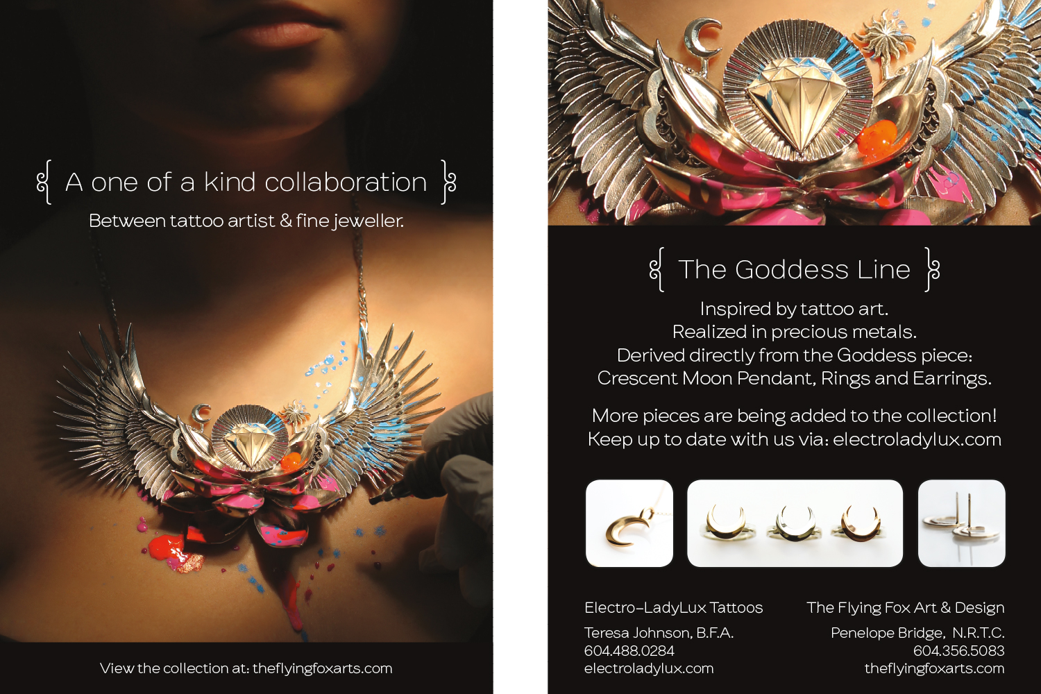
THE FLYING FOX ART AND DESIGN & ELECTRO-LADYLUX TATTOO – COLLABORATION
We created a gorgeous postcard for these two amazing companies to celebrate their collaboration in their respective fields. The Flying Fox is a fine jeweller while Electro-LadyLux Tattoo is, you guessed it, a talented tattoo artist. Based on a tattoo design created by Electro-LadyLux and realized in silver by The Flying Fox, the Goddess Chest Piece Necklace was born! We visited the tattoo shop where we had one of the tattoo artists wear the Goddess Piece while we snapped photos of her as she posed in Teresa’s (the owner of Electro-LadyLux) tattoo chair. The resulting images were amazing and made for a very strong, visually alluring advertisement. We even foiled the necklace and finished it off with a UV coating for an impactful and eye catching print piece.
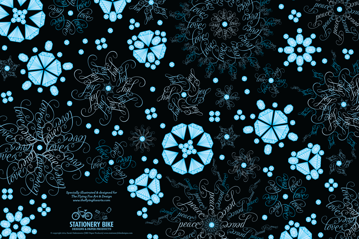
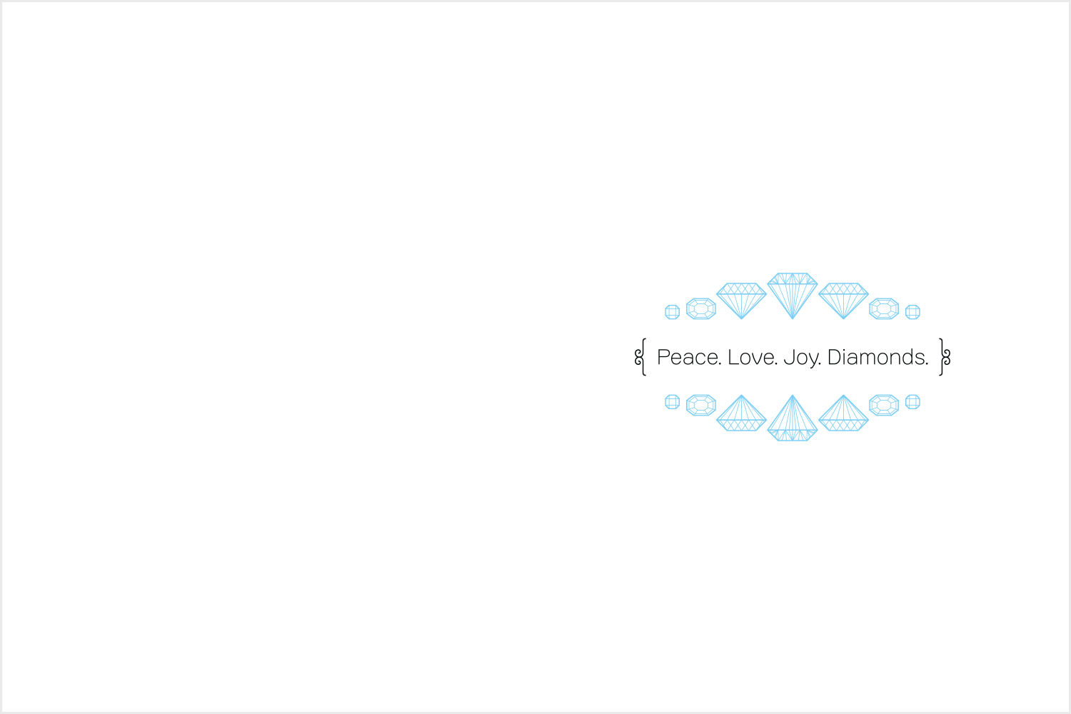
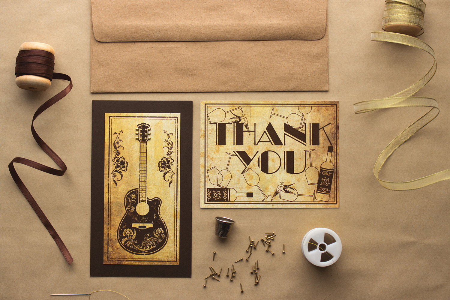
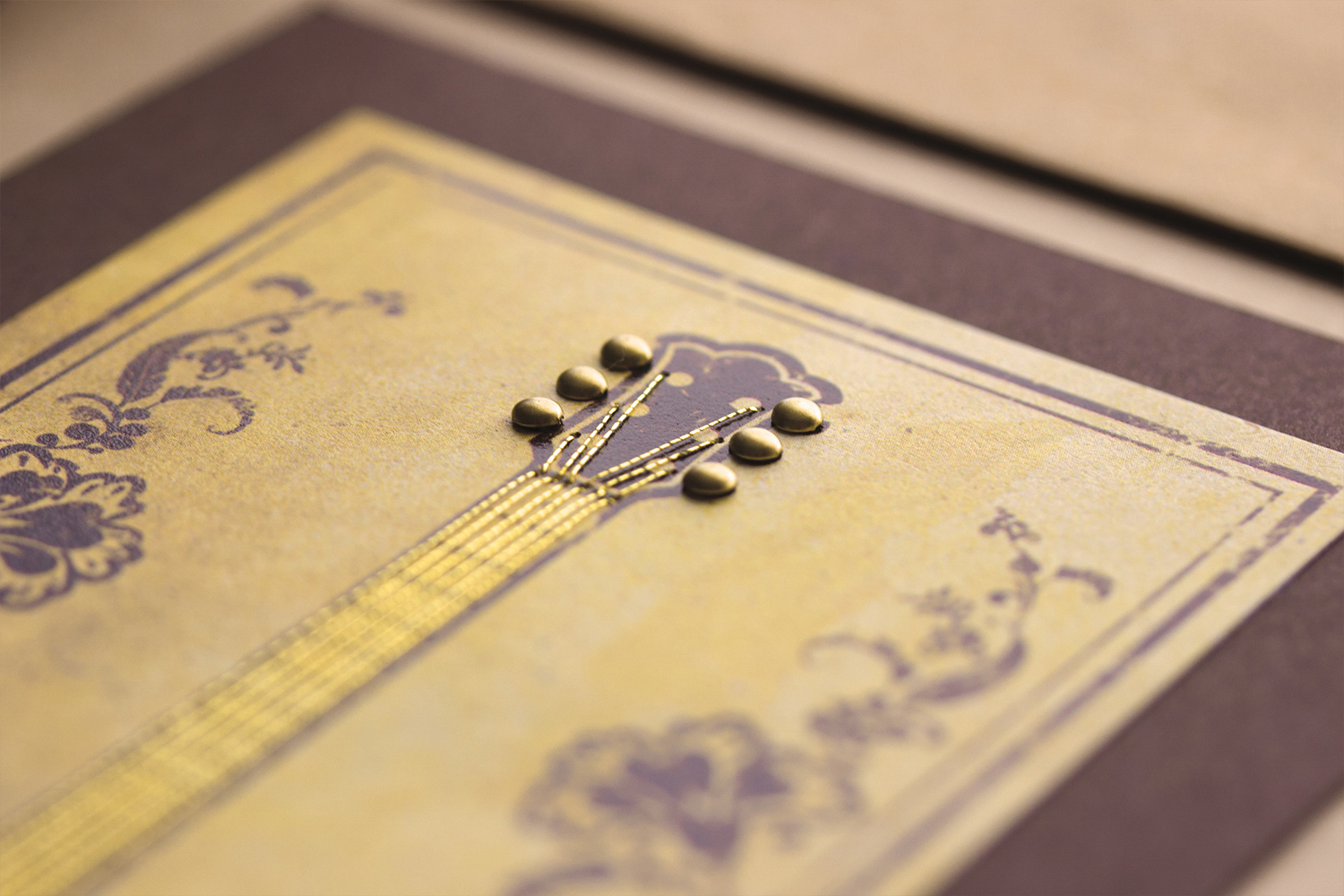
THE FLYING FOX ART AND DESIGN – CHRISTMAS CARD
The Flying Fox loves their customers and wanted to include a custom designed Christmas card with all their winter orders. We were given free reign in deciding what this card would look like. We started thinking about snow and snowflakes and played around with the idea of using holiday words like ‘Peace’, ‘Love’ and ‘Joy’ and arranging them into intricate and delicate snowflakes. We really loved the look of it and decided to add in the tagline ‘Peace. Love. Joy. Diamonds’. The Flying Fox loved it! But we decided to take it a step further and created little gemstones and arranged those into snowflakes, too! The results were instantly whimsical, peaceful and absolutely perfect for the client. We had it printed on a pearl stock which added a nice little shimmer to the card, reminiscent of freshly fallen snow.
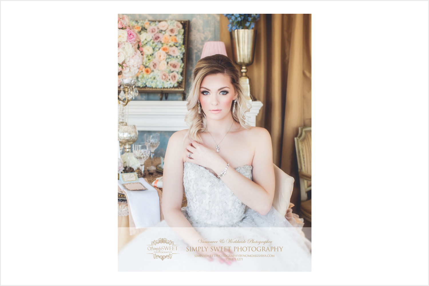
SIMPLY SWEET PHOTOGRAPHY BY NOMO AKISAWA – WEDLUXE FULL PAGE AD
This was Nomo’s debut ad in WedLuxe magazine. We were so honoured to be asked to help with this! Lucky for us we had an absolutely stunning image to work with which automatically made the advertisement very, very beautiful. We set the typography and laid out the design of the ad. Nomo was so very thrilled with our work that she included a fabulous review: ‘(5star) Sarah is such an amazing person and I knew that from the minute that I sat down with her, that she was going to create exactly what I wanted. She was very attentive to what I wanted, asked me tons of questions to get to know my brand, and I have to say that I haven't been this happy with a graphic designer before! Sarah thank you so much for your passion, and of course your wonderful bubbly personality! You have made this process so easy working with you, and I'm looking forward to working with you over and over again in the near future xo’
NICHE STYLISTS – WEDLUXE QUARTER PAGE AD
This happened to be Niche’s first ad in WedLuxe magazine as well!. Coincidentally, the photo used in this ad was taken by Nomo from Simply Sweet Photography. Two fabulous images for two fabulous ads! How did we get so lucky? This ad was typeset and laid out by us and appeared in the same issue as the ad for Simply Sweet Photography.
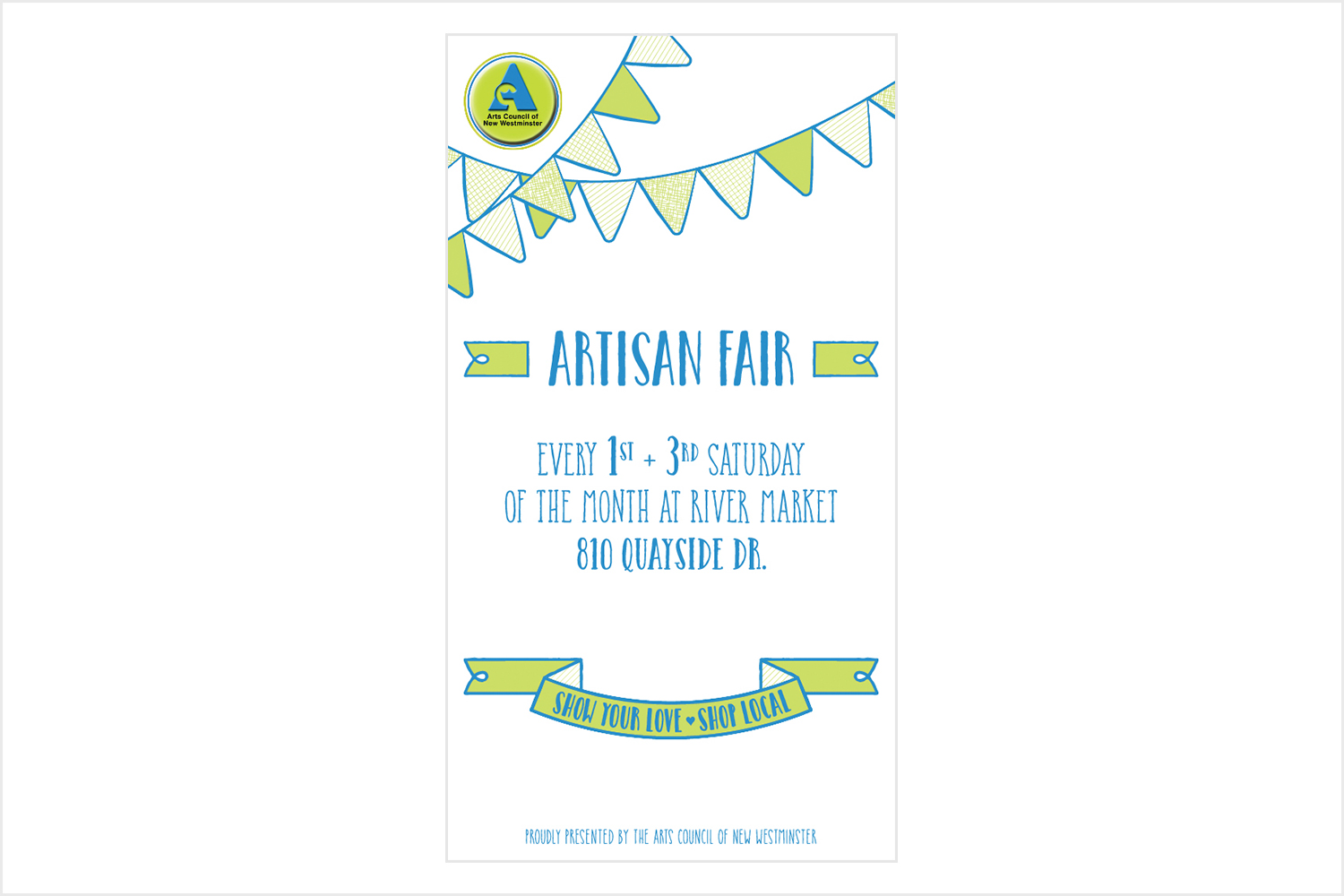
RIVER MARKET – ARTISAN FAIR POSTER
We worked closely with Emiko Takeda from the Arts Council. She took over management of the Artisans Fair held at the River Market in New Westminster. The Artisan Fair is a small market that occurs twice a month and showcases local makers, artists, etc. Having showcased at the River Market before as a vendor selling our stationery, we were very honoured to be invited to work on this project. The fair had been recently taken over by the Arts Council and as of yet did not have its own branding. We decided to highlight the new producers of the fair by using the Arts Council’s logo and colours within the piece. We used a humanistic style typeface to help convey the idea of handmade and artisans/makers. We didn’t want it to be too polished as often handmade items have a lovely, rustic appeal. Emiko loved the approach and quickly printed out copies of the poster to distribute throughout New Westminster, along with emailing the image to the Artisan Fair email list. It was very well received.
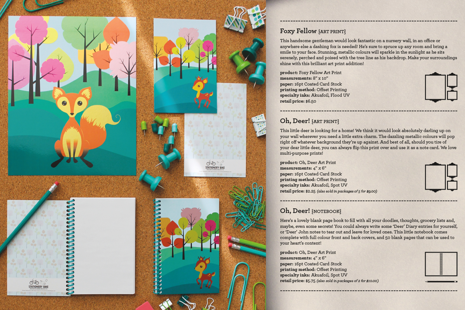
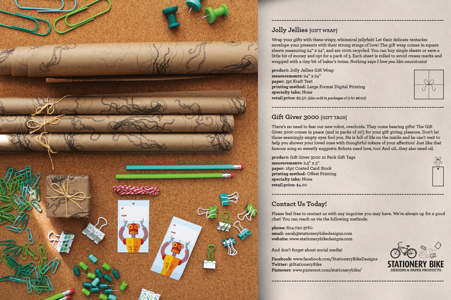
STATIONERY BIKE DESIGNS – CATALOGUE
We created a mini catalogue for our stationery line. It’s meant as a takeaway for customers who visited our booth at craft shows in which we were participating. We really wanted to convey ourselves/our personality through the branding and opted for cute, fun and witty write-ups for each item. We also decided to create a visual system to quickly and easily identify what the reader was seeing at a glance. We illustrated individual icons to easily identify the object: notebook, notecards, greeting cards, stickers, gift tags, gift wrap. We took the photos for the catalogue ourselves and laid out the entire design and illustrations. We have had very positive reactions to the catalogue, with people commenting on how much they appreciate the attention to detail and the clean, consistent layout. It’s a great little promotional piece!

PROMOTIONAL PRINT CALENDARS
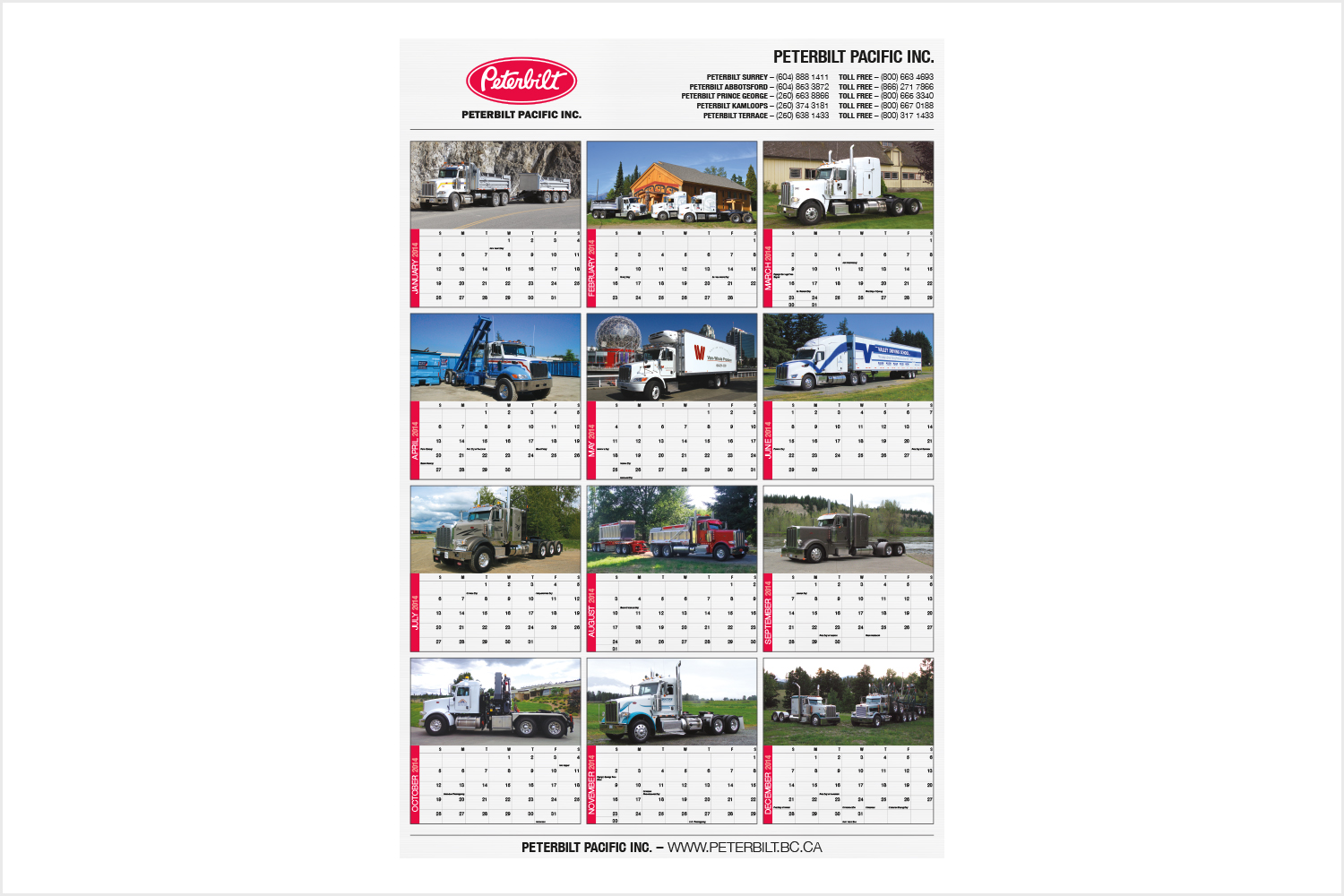
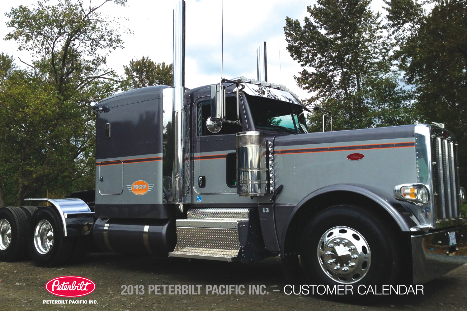
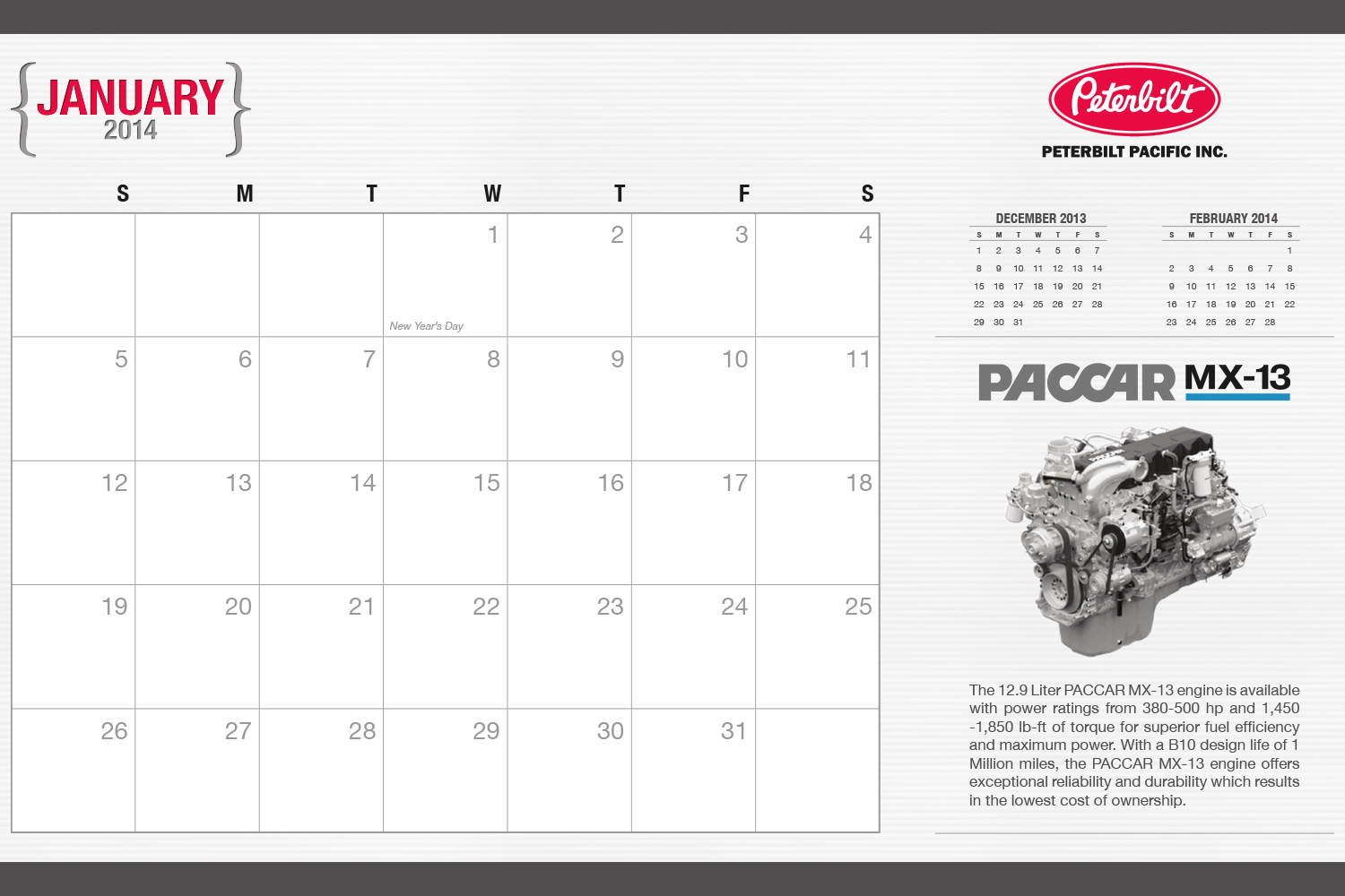
PETERBILT PACIFIC INC.
This client is an automotive company specializing in the sales, parts and service of Peterbilt trucks. In fact, they are one of Canada’s largest Peterbilt dealers. We have been working with them for the last 3 years on their annual company calendars. Together, we create a 12 month wire-o bound wall calendar, a large format 12 month calendar poster and a mini vinyl sticky calendar. The various customers of Peterbilt love contributing their own photos of their trucks to include into the calendar. We receive the images, clean them up a bit, edit them for colour and then lay them out into the calendars we have designed for them. They are always so happy with our full service design and printing. We source out quotes for printing and make all the necessary arrangements directly with the printer. Peterbilt really appreciates the full service we provide them, from design, to printing & delivery.

STATIONERY
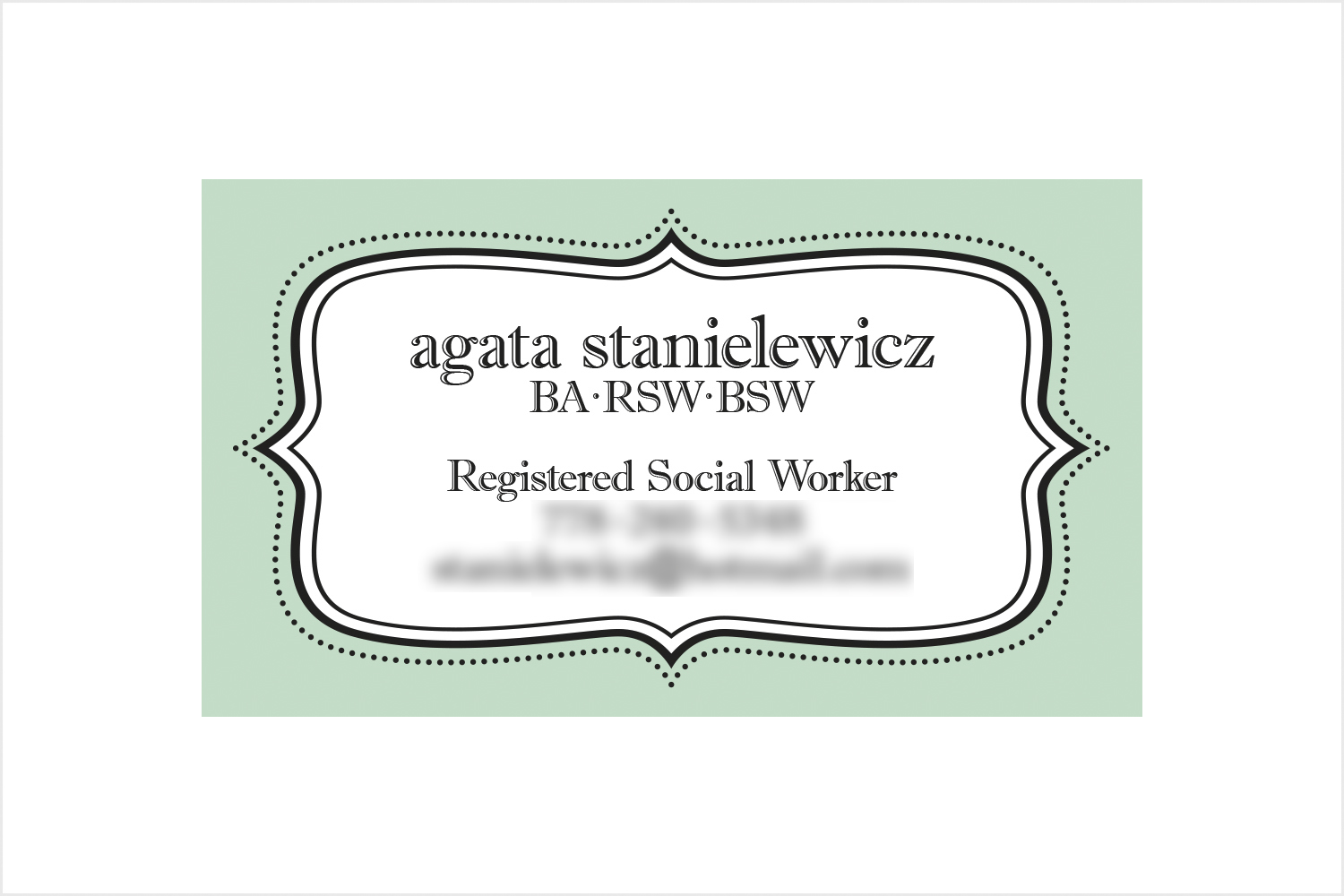
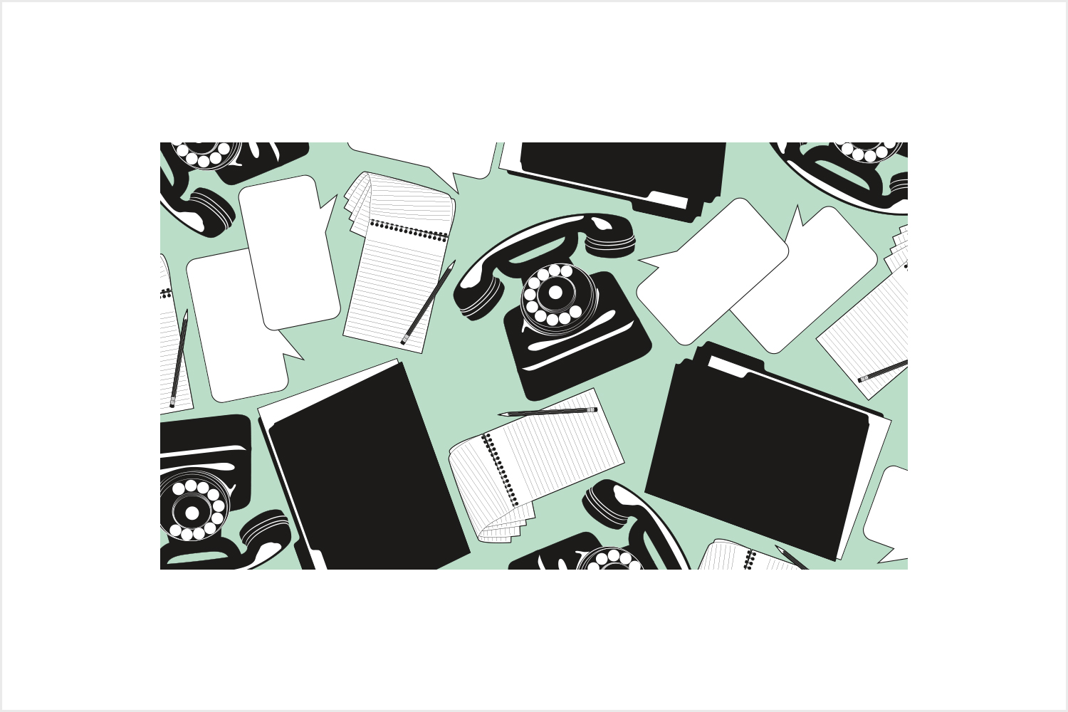
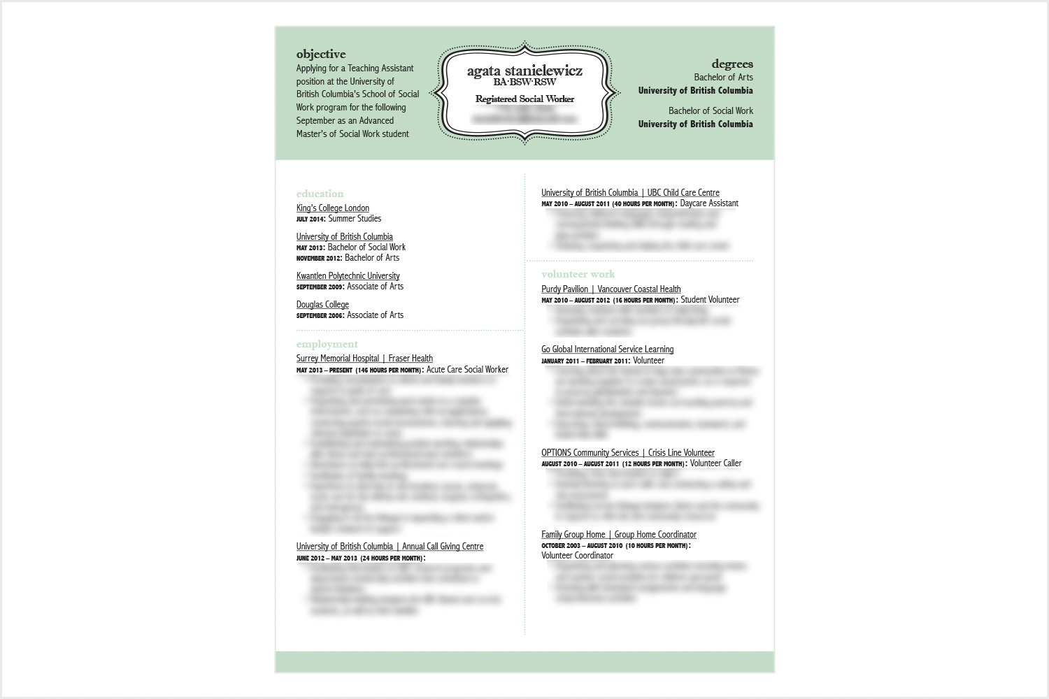
AGATA STANIELEWICZ – SOCIAL WORKER
Our client was in desperate need for a business card and resume. Dealing with a subject such as social work can be very difficult to represent visually. How do you get across the most important aspects of social work in a sensitive, respectful manner? And how does that visually look? When interviewing our client we started by asking every single thing we could about social work: What do you do in a typical day? How do you help people? What sorts of items/supplies do you use on a regular basis?
Through our conversations we came up with the idea of representing social work (an abstract idea) through physical icons that you can instantly relate to social work: a telephone (an important tool for a social worker), file folders (each person has their own file), a notepad and pencil (for extensive patient notes) and, of course, speech bubbles to help convey the conversation/communication aspect that makes up the majority of social work. We didn’t include the full resume write-up out of respect for our client’s privacy.
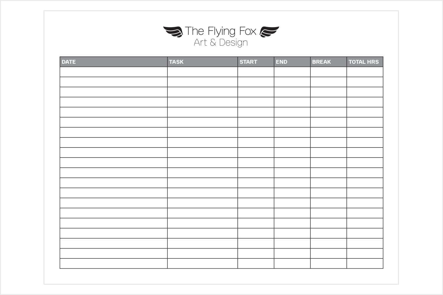
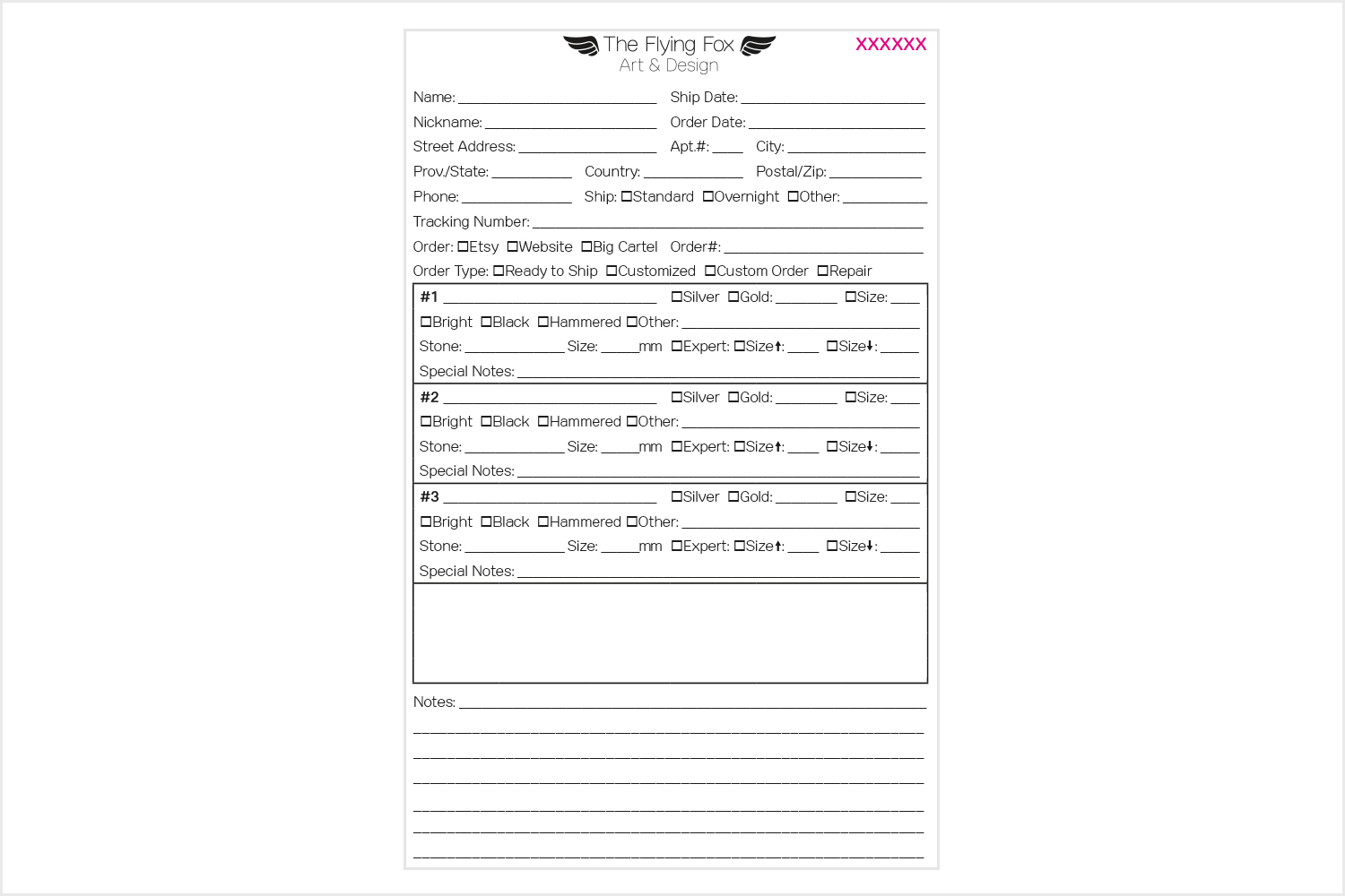
THE FLYING FOX ART AND DESIGN – DOCKETS & TIME SHEETS
Our client was in need of some time tracking sheets and internal dockets to help with work flow and production. She regularly has dozens of orders in various stages of the jewellery making process. We decided that her lined speech cards just weren’t cutting it. Through this custom docket we fit in every single possible piece of information she would need to be able to complete any given order. There is space for the customer’s name and nickname (for Etsy orders), order numbers, due date, order date, and even a spot at the bottom reserved for a future project: Creating custom stamps for each ring design so that the client didn’t have to draw out the ring setting each time by hand. The docket is efficient and conveniently is printed out onto an envelope, creating an instant pouch to hold the order’s ring setting/s, gem/s, etc. It’s the perfect combination for a busy, busy jeweller: Efficient, effective and streamlined.
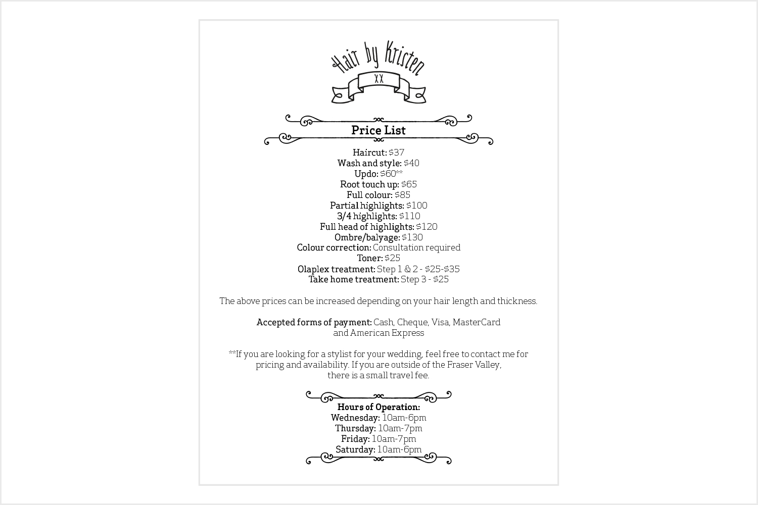
HAIR BY KRISTEN
In addition to a simple logo, our client was in need of a price list that she could proudly display at her work station. We followed the aesthetic we had laid out with the logo and created a very sweet and cute price list that would answer all her clients’ questions. She also posted it online as an added convenience for her clients. She refers to her clients as guests and we think that added touch of sweetness is a perfect fit for Kristen and her business.
WEB GRAPHICS/IMAGERY
HAIR BY KRISTEN
Kristen did not have any imagery to put up onto her Facebook Page. As an added bonus to her simple logo, we set up a mini styled shoot of Kristen’s go to hair products and tools: curling iron, blow dryer, bobby pins, combs, scissors, etc. We took a variety of photos for her and she gladly thanked us and promptly put them up onto her Facebook Page with pride. As we've said before, we are currently working on a more refined branding approach for Kristen. We're excited for what we will come up with together!
ILLUSTRATION
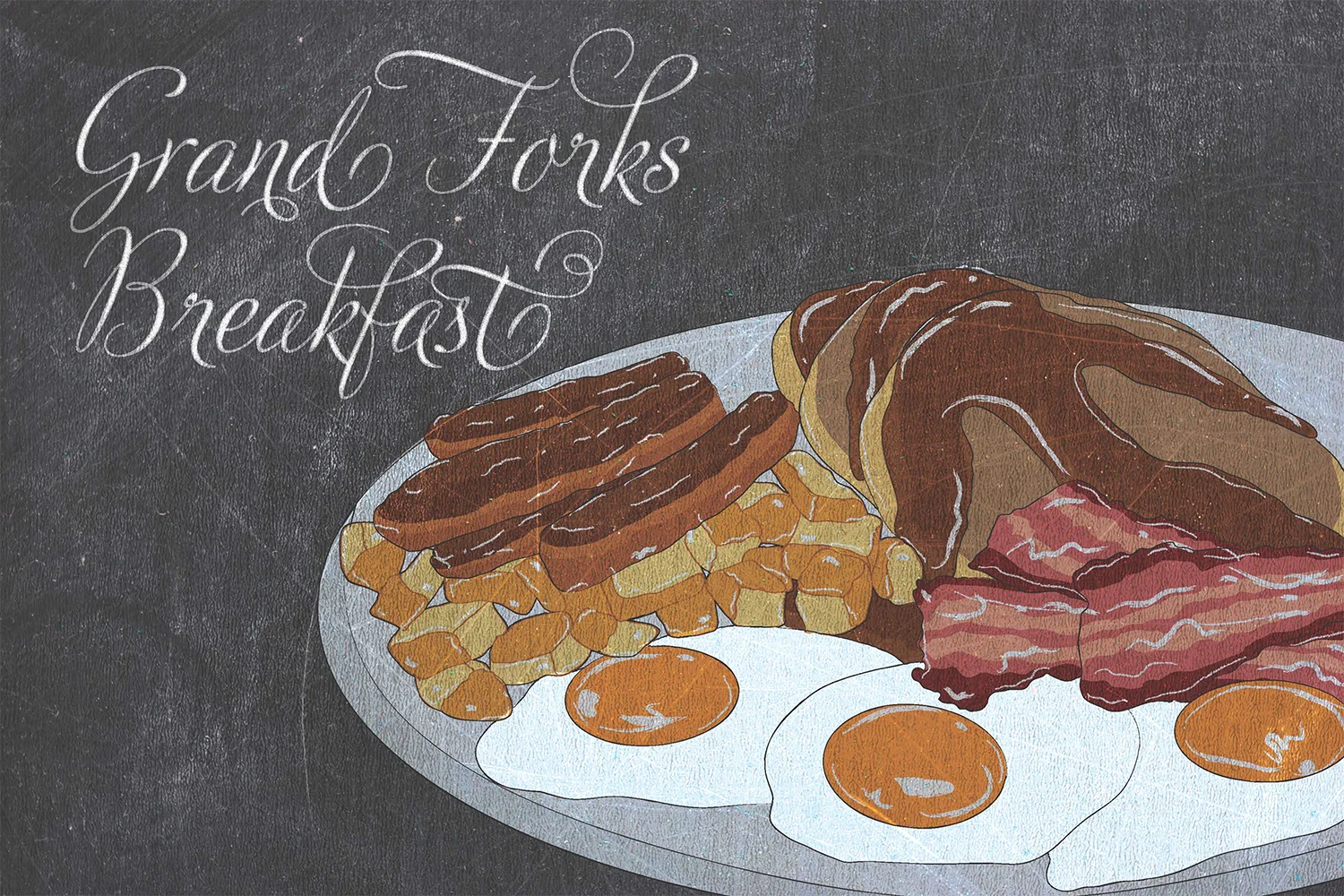
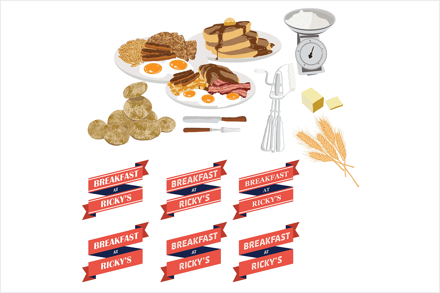
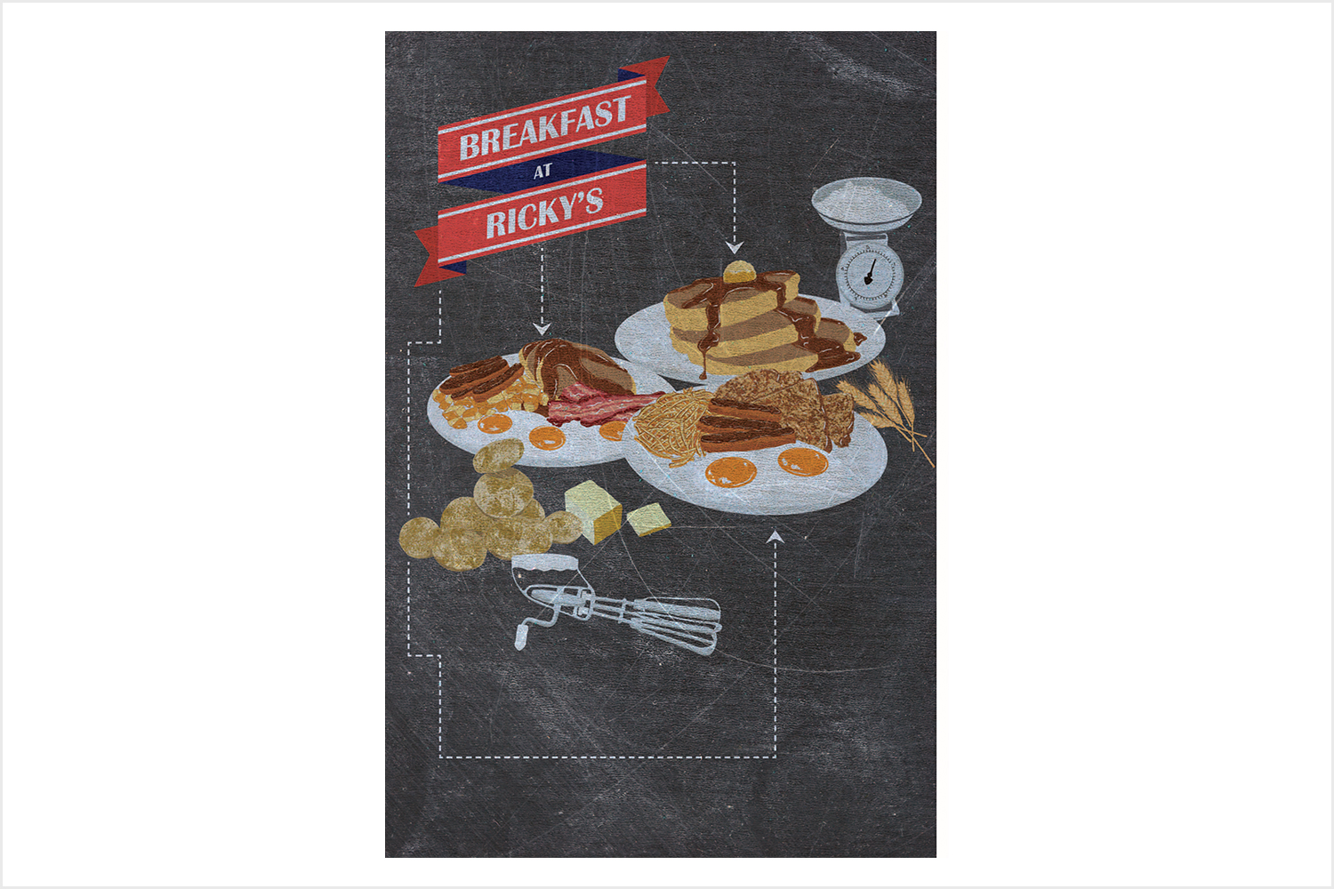
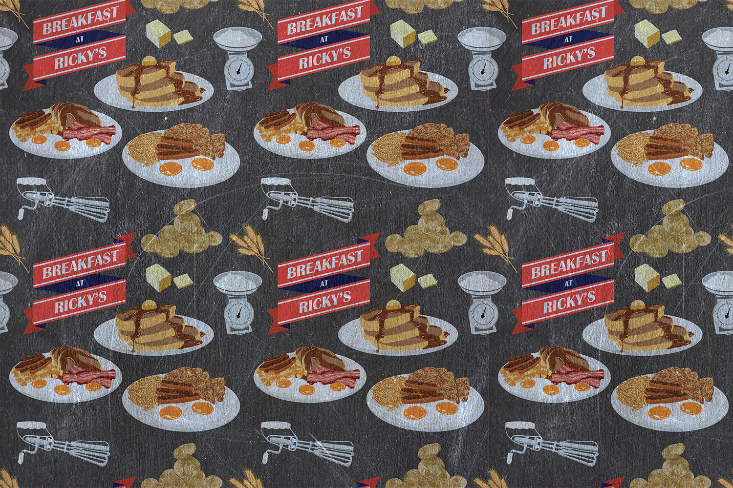
RICKY'S ALL DAY GRILL – MURAL CONCEPT ART
Ricky’s approached us to create some concept illustrations for a venture they were exploring within their restaurants. The idea was to illustrate their breakfast staples in a chalkboard style for a large scale mural in their various locations. This project was only at the conceptual stage but we were honoured nonetheless to be a part of it! We poured over their delicious imagery and produced a variety of illustrations based on our project brief. They were very pleased with our approaches and we had an amazing time illustrating their yummy breakfasts!
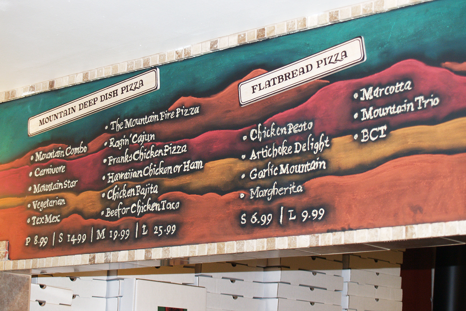
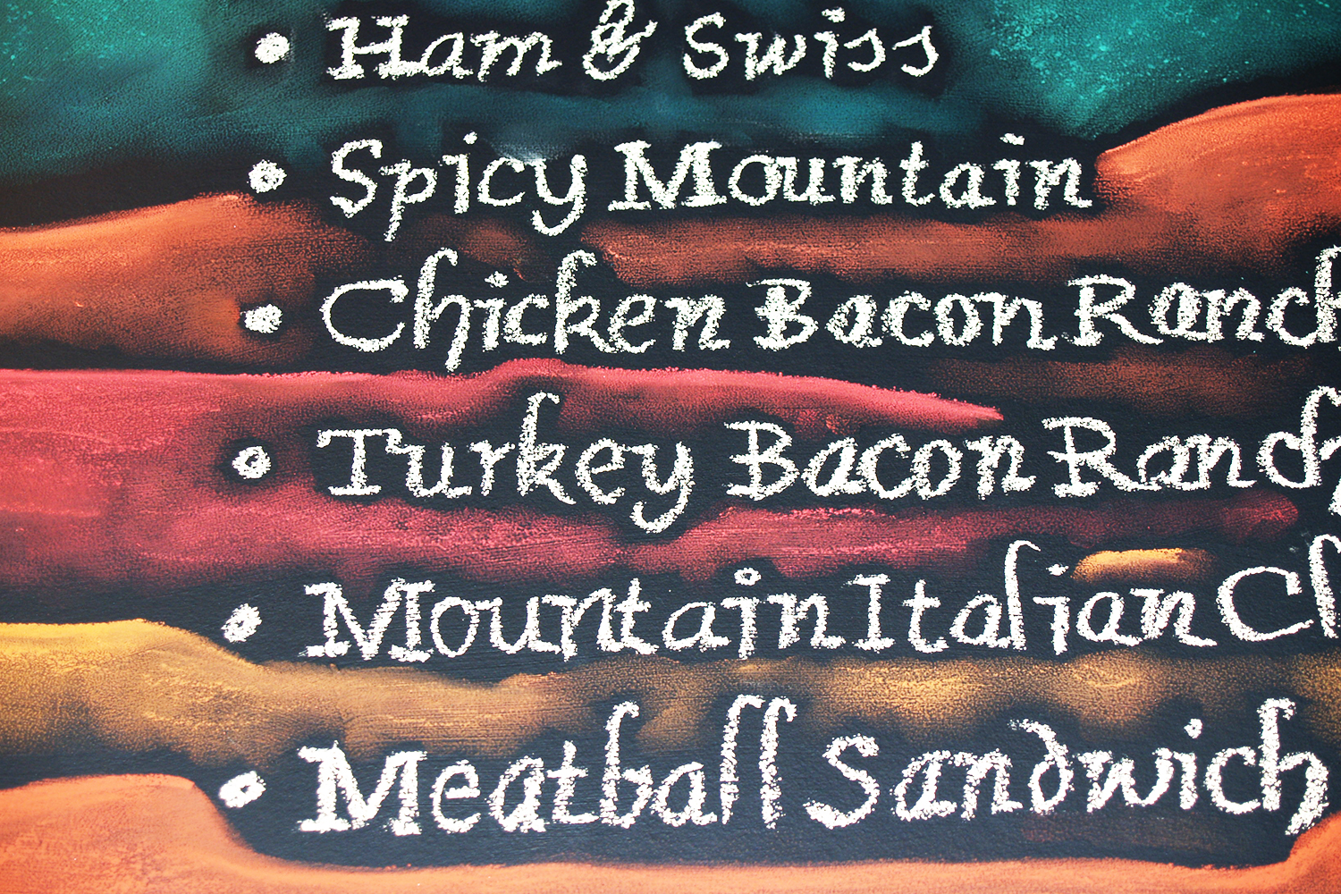
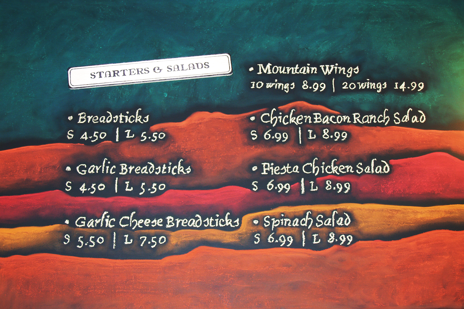
COAST MOUNTAIN PIZZA – CHALK MENU
Coast Mountain Pizza was a delicious venture! Their pizza was phenomenal and their location was adorable. They had approached us to create a hand illustrated chalkboard menu for their delectable dishes! We mimicked their existing branding and incorporated the mountains they had on their business cards and other stationery. The whole process was amazing! We set up a projector to help with our illustration and wording that we had created beforehand. The projector allowed us to keep our lines straight and transfer our drawing to the correct scale without making a mistake in proportions. The results were fantastic and their customers frequently commented on the menus and how much they loved them!
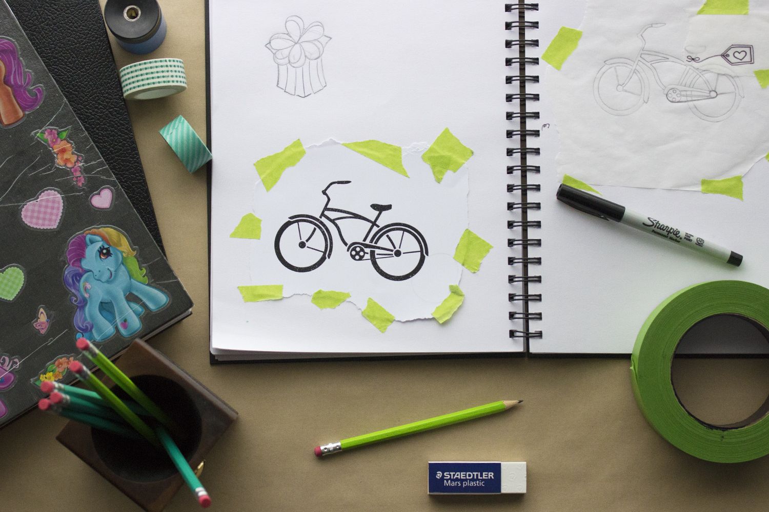
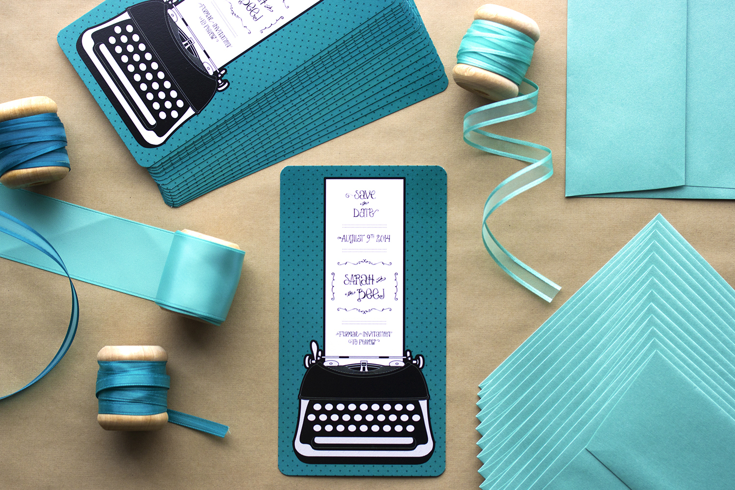
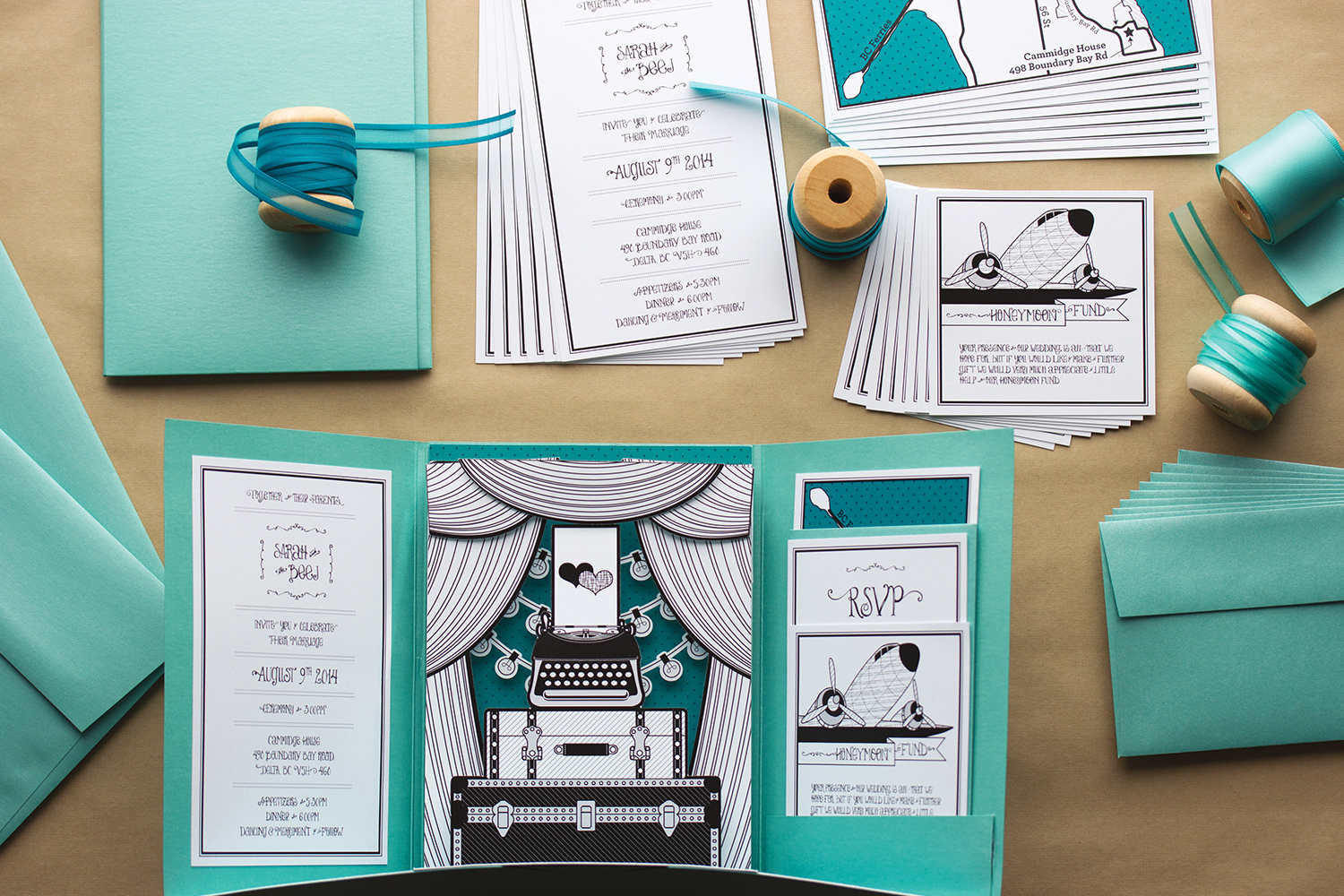
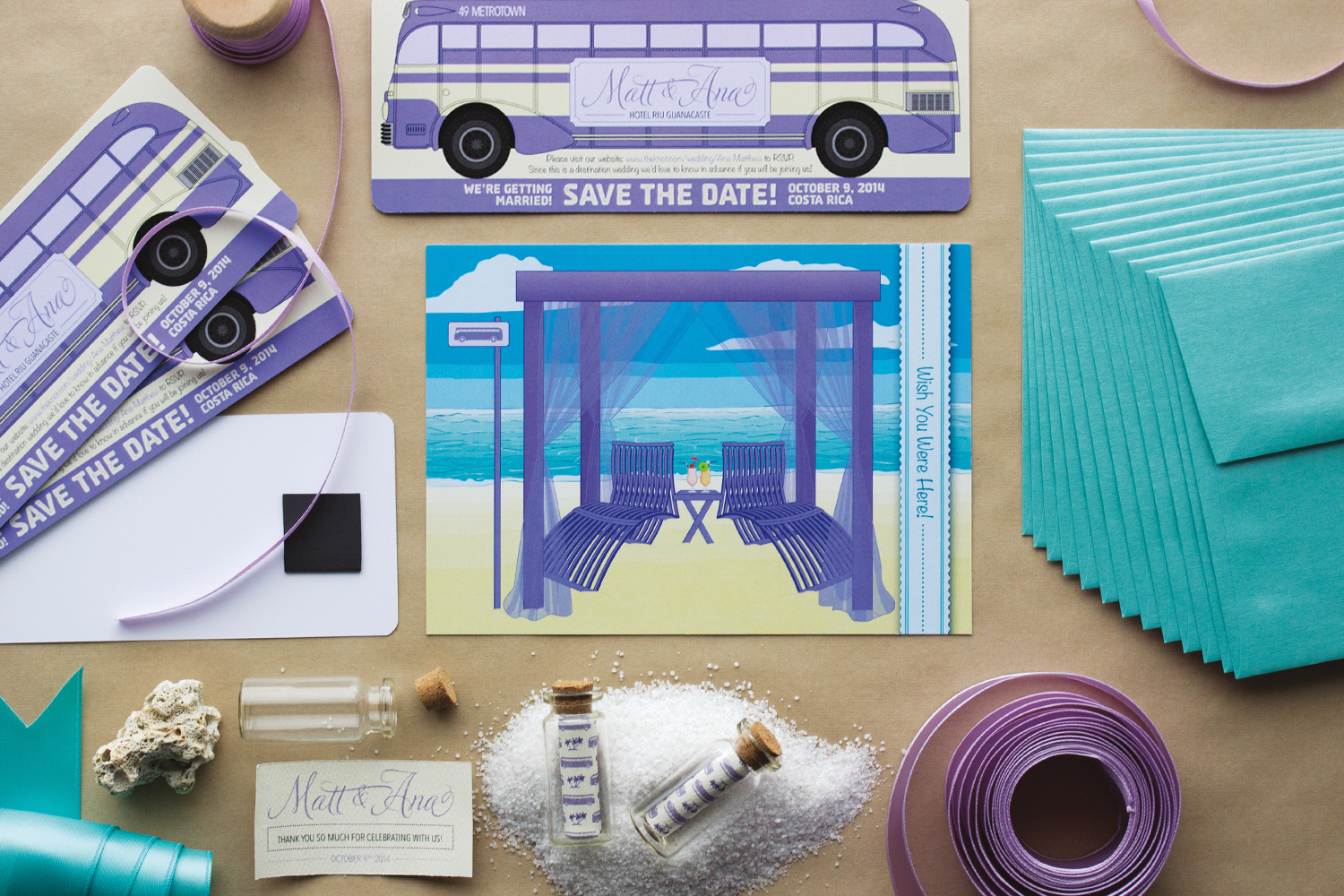
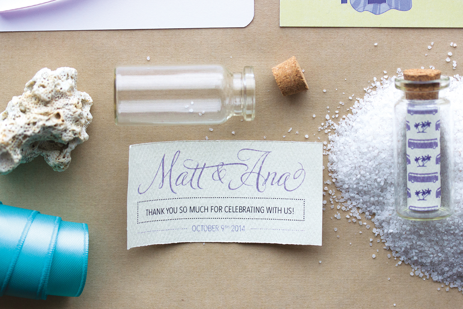
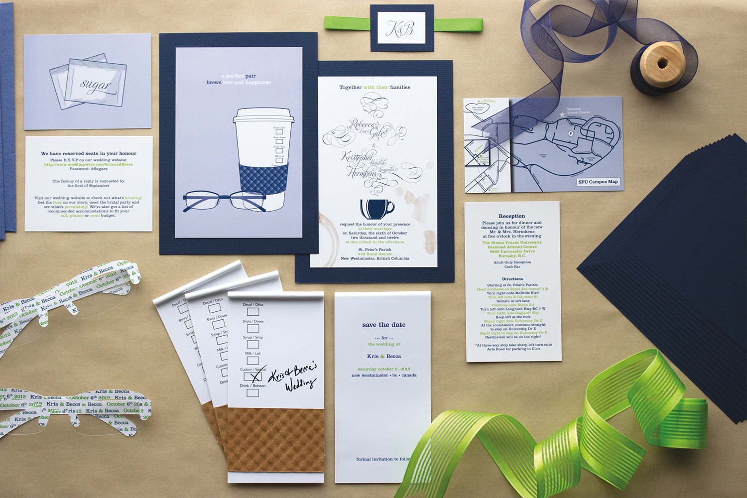
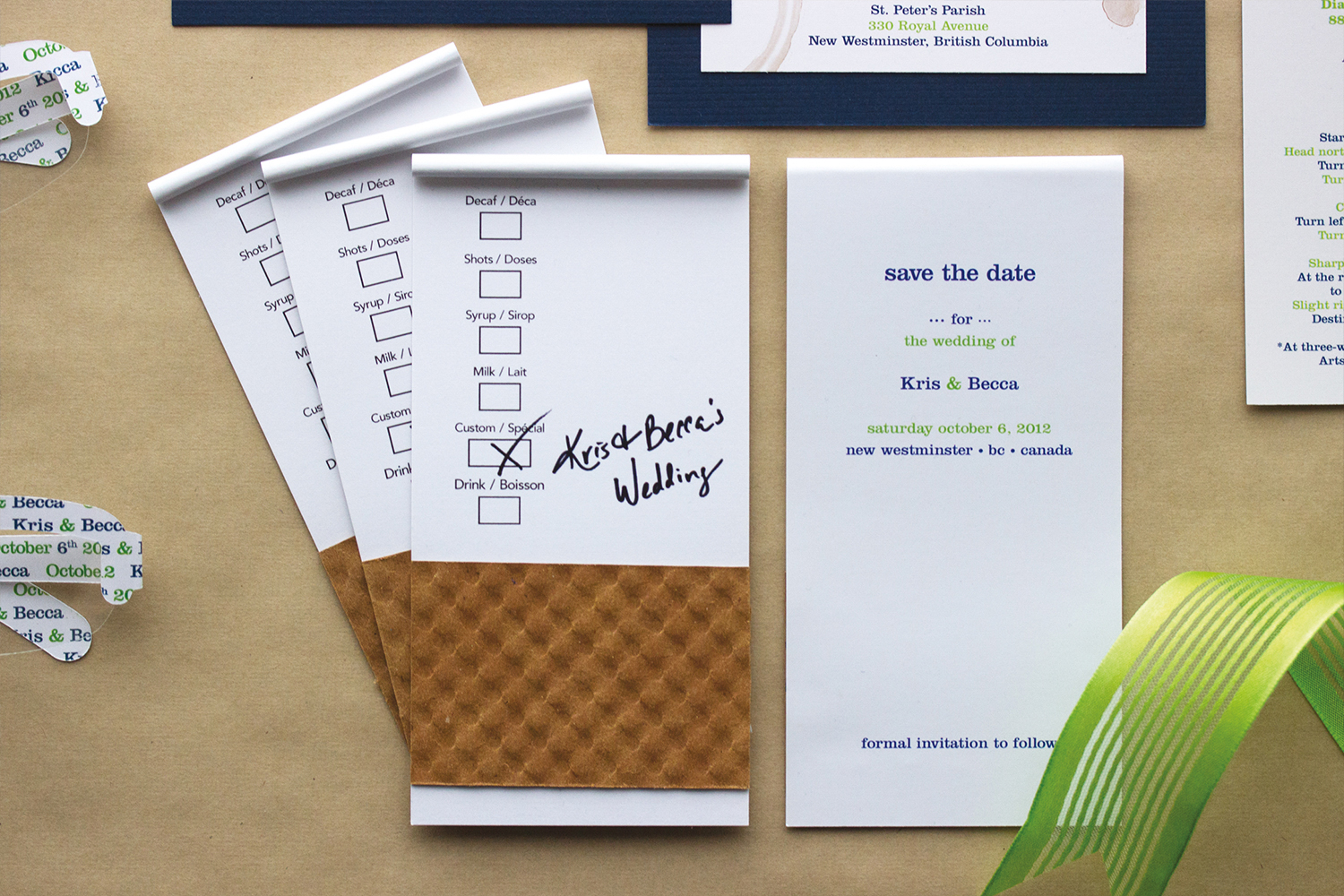
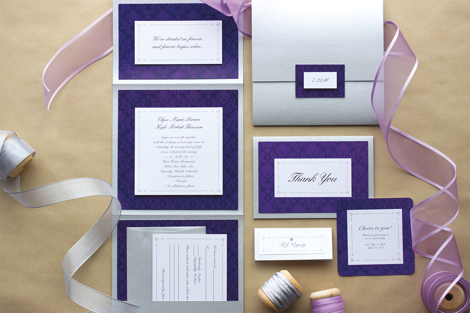
WEDDING INVITATIONS
As often as possible we love to illustrate our own projects. Most of our illustrations live on through people’s wedding invitations and we couldn’t be more thrilled to have our drawings immortalized in this way! What an honour! Below you will find a variety of our illustrations as seen through our custom wedding stationery.
Thank you so much for taking the time to look through our portfolio. We hope you enjoyed it!
Would you like to get in touch with us for your project? Contact us today for a complimentary meeting!